Help us build this. Leave comments, suggest improvements, and help create better design documentation for agents.
Endowus
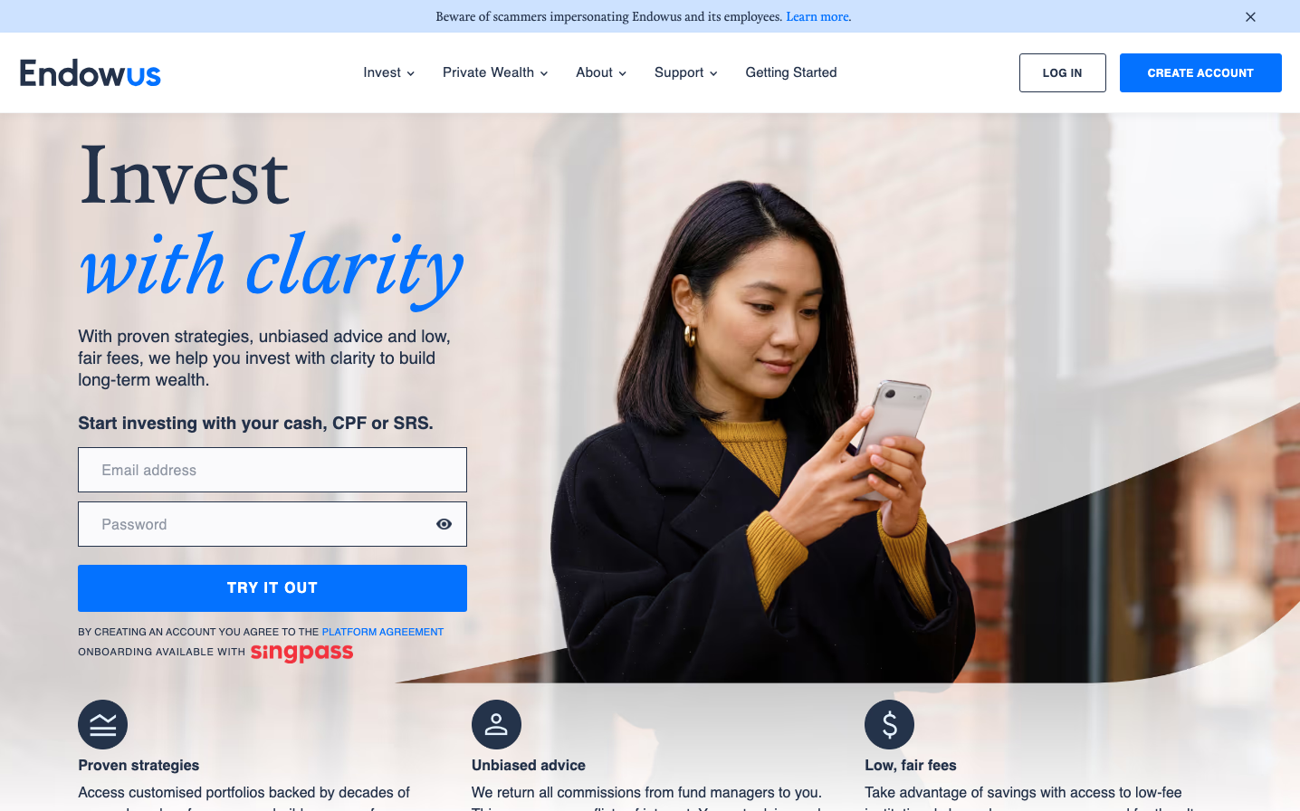
FintechEndowus blends editorial sophistication with financial accessibility through its distinctive serif-sans typography pairing and calming blue-teal signature color. The design creates intellectual warmth - serious enough for wealth management yet approachable enough for everyday investors.
Design Identity
Signature Color
Endowus Blue
#2B7CE9
trustworthy financial clarity and accessible expertise
Visual Identity
The striking combination of elegant serif headlines (Calendas Plus) with clean sans-serif body text (Lato) creates an unmistakable editorial-meets-fintech aesthetic that feels both authoritative and approachable.
Component Style
Soft, rounded corners with subtle shadows and clean borders. Buttons have generous padding with 6-8px border radius. Form inputs are spacious with gentle gray borders and ample internal padding, creating a welcoming rather than sterile feel.
Spacing Philosophy
Generous breathing room with large section gaps and asymmetrical left-aligned layouts. The hero section uses dramatic whitespace to create focus, while form elements have comfortable 16px+ internal spacing.
Design Principles
- Headlines always use Calendas Plus serif at large sizes (32px+)
- Body text exclusively uses Lato sans-serif at 14-16px
- Border radius stays between 6-8px for softness without being playful
- Blue accent color dominates CTAs and interactive elements
- Form layouts prioritize vertical rhythm with consistent 16px+ spacing
Target Audience
Educated millennials and Gen X professionals seeking sophisticated yet accessible wealth management - people who read financial publications but want technology to simplify complexity.
Mood
Design descriptions are AI-generated based on visual analysis and may not fully reflect the brand's official design guidelines.
Design System
Typography Scale
| Element | Font | Size | Weight | Line Height |
|---|---|---|---|---|
| body | 16px | 400 | 24px | |
| h1 | 90px | 400 | 99px | |
| h2 | 40px | 400 | 52px | |
| h3 | 32px | 400 | 40px | |
| h4 | 40px | 400 | 44px | |
| p | 16px | 400 | 24px | |
| a | 14px | 400 | 20px | |
| input | 14px | 400 | 20px | |
| nav | 16px | 400 | 24px | |
| footer | 16px | 400 | 24px |
Color Palette
#e9ebee#f9fafc#d2e9ee