Help us build this. Leave comments, suggest improvements, and help create better design documentation for agents.
Everli
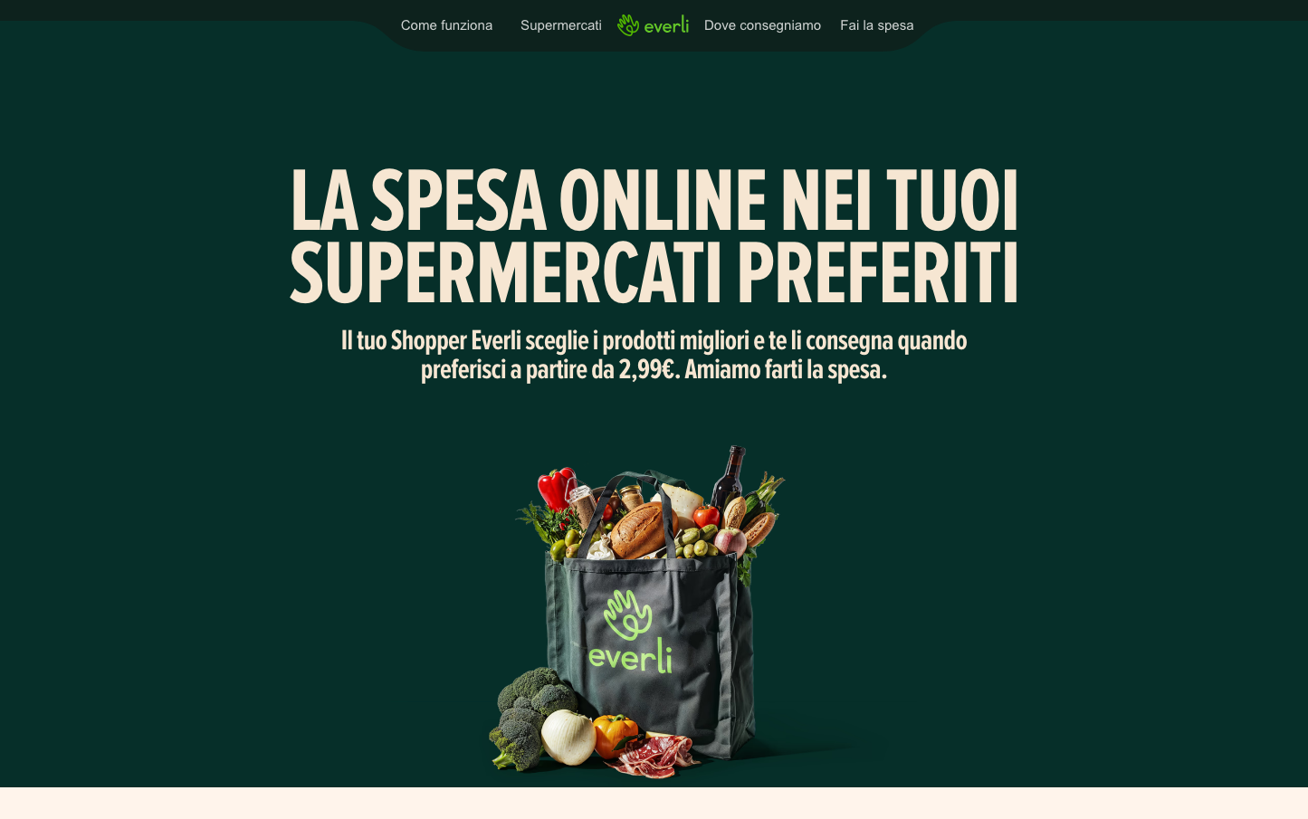
GroceryEverli creates a sophisticated appetite through its deep forest-green backdrop that feels premium yet approachable, like an upscale organic market. The ultra-condensed headline typography creates dramatic impact while maintaining grocery-friendly warmth, positioning online shopping as both convenient and artisanal.
Design Identity
Signature Color
Everli Forest
#1a4a3a
Premium organic trust - the deep green of high-end natural markets that signals quality over quantity
Visual Identity
The dramatic ultra-condensed headline typography paired with a shopping bag hero shot on rich dark green - it's unmistakably premium grocery positioning that feels more Whole Foods than Walmart.
Component Style
Clean, minimal components with gentle rounded corners and no visible shadows - everything feels organic and unprocessed, like the food itself. Buttons likely have subtle 6-8px radius to maintain approachability.
Spacing Philosophy
Generous vertical breathing room around the hero content creates premium positioning, while the centered layout with ample negative space reinforces the 'curated selection' feeling over cluttered marketplace chaos.
Design Principles
- Headlines use ultra-condensed typography at massive scale (100px) for maximum impact
- Body text stays modest at 14-16px to not compete with food imagery
- Green dominates as the trust-building color across all touchpoints
- Typography mixing: condensed for headlines, rounded Poppins/Inter for body
- Centered layouts with generous whitespace reinforce premium positioning
Target Audience
Time-pressed urban professionals who prioritize organic/quality food but lack time to shop - think busy parents in affluent neighborhoods who want farmers market quality with Amazon convenience
Mood
Design descriptions are AI-generated based on visual analysis and may not fully reflect the brand's official design guidelines.
Design System
Typography Scale
| Element | Font | Size | Weight | Line Height |
|---|---|---|---|---|
| body | 12px | 400 | normal | |
| h1 | 100px | 400 | 80px | |
| h2 | 52px | 500 | 62.4px | |
| h3 | 36px | 400 | 43.2px | |
| h5 | 20px | 600 | 24px | |
| p | 14px | 500 | 16.8px | |
| a | 12px | 400 | normal | |
| button | 16px | 500 | normal | |
| footer | 12px | 400 | normal |
Color Palette
No colors extracted