Help us build this. Leave comments, suggest improvements, and help create better design documentation for agents.
Oda
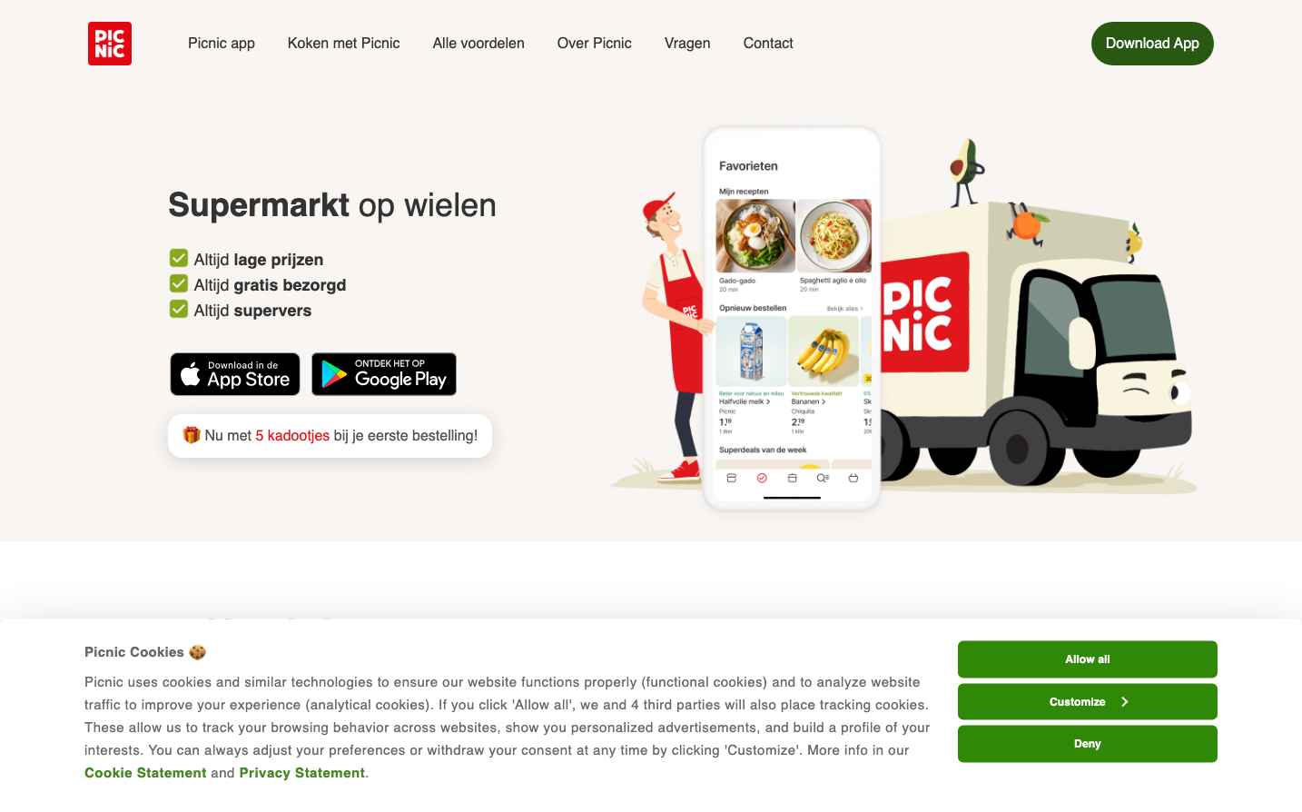
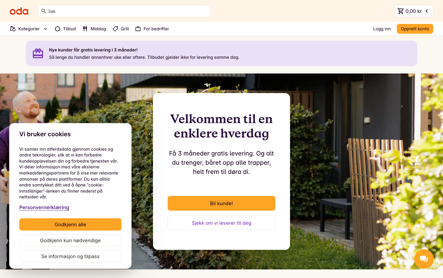
GroceryOda creates a warm, approachable Norwegian grocery experience through its distinctive orange CTA system and elegant Galaxie Copernicus serif headings. The brand balances everyday accessibility with premium quality through generous whitespace, purple accent notifications, and a sophisticated dual-typography hierarchy that makes grocery shopping feel elevated yet familiar.
Design Identity
Signature Color
Oda Orange
#FF7A00
Warm accessibility meets premium grocery confidence - inviting yet decisive action
Visual Identity
The purple notification banners with gift icons and the distinctive orange rounded buttons create an unmistakable Scandinavian e-commerce aesthetic that prioritizes customer delight and gentle persuasion over aggressive selling.
Component Style
Softly rounded components with 8px radius buttons and generous padding create a friendly, touchable interface. The orange primary buttons feel substantial without being heavy, while the purple notification cards have a gentle, non-intrusive presence. Everything feels approachable and human-scaled.
Spacing Philosophy
Generous vertical breathing room with large hero sections and comfortable component separation. The interface prioritizes readability and reduces cognitive load through abundant whitespace, creating a calm shopping environment that doesn't rush the user.
Design Principles
- Orange CTAs use 8px border radius for friendly approachability
- Galaxie Copernicus serif headings at 36px/700 weight create premium editorial feel
- Purple notification cards provide gentle guidance without interruption
- Inter var at 450 weight maintains excellent readability at all sizes
- Component padding never feels cramped - minimum 16px internal spacing
Target Audience
Urban Norwegian families who value quality groceries and appreciate thoughtful, unhurried digital experiences over aggressive e-commerce tactics
Mood
Design descriptions are AI-generated based on visual analysis and may not fully reflect the brand's official design guidelines.
Design System
Typography Scale
| Element | Font | Size | Weight | Line Height |
|---|---|---|---|---|
| body | 16px | 450 | 16px | |
| h2 | 36px | 700 | 46.8px | |
| h3 | 16px | 450 | 24px | |
| p | 20px | 600 | 30px | |
| a | 16px | 600 | 24px | |
| button | 16px | 400 | 18.4px | |
| input | 14px | 450 | 19.6px | |
| nav | 16px | 450 | 16px | |
| header | 16px | 450 | 16px | |
| footer | 16px | 450 | 16px |
Color Palette
No colors extracted