Help us build this. Leave comments, suggest improvements, and help create better design documentation for agents.
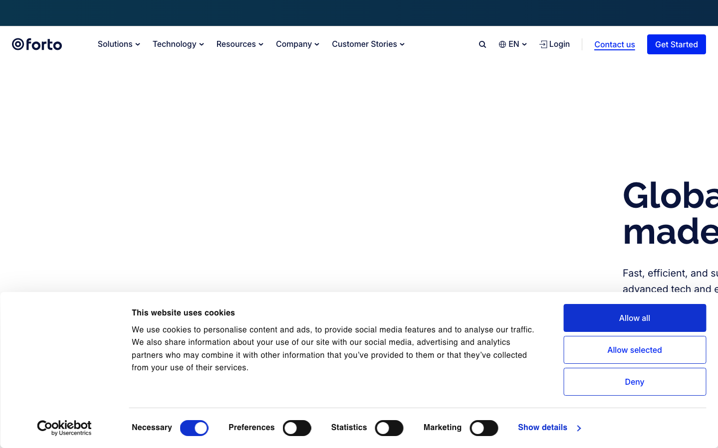
Forto
LogisticsForto employs a stark navy-and-white minimalist aesthetic that evokes maritime precision and B2B logistics authority. The massive Raleway headlines create imposing hierarchical statements while generous whitespace reinforces enterprise-level sophistication and operational clarity.
Design Identity
Signature Color
Forto Electric Blue
#2E5BFF
logistics technology precision and global connectivity trust
Visual Identity
Dramatic scale contrasts between oversized headlines and body text, combined with ocean-like expanses of white space that mirror cargo ship efficiency and global shipping routes.
Component Style
Clean rectangular buttons with moderate 6-8px rounded corners, solid fills without decorative shadows. Components feel substantial and trustworthy rather than playful - built for enterprise decision-makers who value clarity over visual flourishes.
Spacing Philosophy
Generous macro-spacing creates breathing room that suggests global scale and enterprise confidence, while tight component spacing maintains operational efficiency. Large sections are separated by 80-120px gaps that mirror the vastness of international logistics.
Design Principles
- Headlines use Raleway at massive 72px scale to establish authority
- Body text maintains readable 20px with 32px line-height for professional comfort
- Color palette stays monochromatic with navy #0a143c and white for trust
- Button text uses 700 weight for decisive call-to-action confidence
- Natural shadows at 6px create subtle depth without visual noise
Target Audience
Global supply chain managers and logistics executives who need enterprise-grade freight solutions and value operational transparency over flashy marketing
Mood
Design descriptions are AI-generated based on visual analysis and may not fully reflect the brand's official design guidelines.
Design System
Typography Scale
| Element | Font | Size | Weight | Line Height |
|---|---|---|---|---|
| body | 20px | 400 | 32px | |
| h1 | 72px | 700 | 72px | |
| h2 | 40px | 600 | 46.4px | |
| h3 | 20px | 600 | 30px | |
| p | 16px | 400 | 25.6px | |
| a | 16px | 400 | 25.6px | |
| button | 16px | 700 | 24px | |
| input | 16px | 400 | 25.6px | |
| nav | 16px | 400 | 25.6px | |
| header | 20px | 400 | 32px |
Color Palette
#000000#abb8c3#ffffff#f78da7#cf2e2e#ff6900#fcb900#7bdcb5#00d084#8ed1fc#0693e3#9b51e0