Help us build this. Leave comments, suggest improvements, and help create better design documentation for agents.
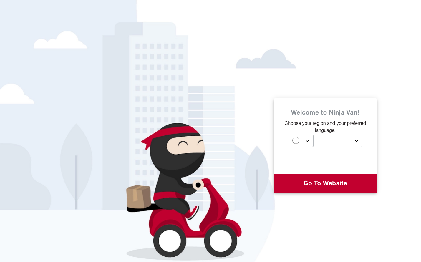
Ninja Van
LogisticsNinja Van creates a playful yet professional delivery brand through warm crimson red paired with friendly ninja mascot illustrations. The design balances approachable cartoon aesthetics with clean interface elements, evoking trust and reliability while maintaining a sense of speed and agility through the ninja delivery character.
Design Identity
Signature Color
Ninja Crimson
#d62d20
speed, reliability, and energy - communicating fast delivery with passionate service
Visual Identity
The distinctive ninja character mascot on delivery vehicles creates instant brand recognition - a friendly, cartoon-style delivery person in signature red and black that humanizes the logistics experience.
Component Style
Clean, rounded components with generous padding and soft shadows. Buttons have moderate border radius (6-8px), dropdown selectors with subtle borders, and the overall feel is approachable rather than sharp - prioritizing user comfort over corporate precision.
Spacing Philosophy
Generous whitespace creates breathing room around the central illustration and form elements. The layout uses asymmetrical balance with the ninja character anchoring the left side while the welcome panel floats independently on the right.
Design Principles
- Character illustration dominates the visual hierarchy
- Red color is used sparingly but prominently for CTAs and branding
- Rounded corners never exceed 8px for friendliness without being childish
- Typography uses Lato at 16px base size with 400 weight for readability
- Muted city background provides context without competing for attention
Target Audience
Small business owners and individual consumers who want reliable delivery service with a personal, trustworthy touch rather than faceless corporate logistics.
Mood
Design descriptions are AI-generated based on visual analysis and may not fully reflect the brand's official design guidelines.
Design System
Typography Scale
| Element | Font | Size | Weight | Line Height |
|---|---|---|---|---|
| body | 16px | 400 | 24px | |
| main | 16px | 400 | 24px |
Color Palette
#03b2cb#000000#3b82f6#ffffff