Help us build this. Leave comments, suggest improvements, and help create better design documentation for agents.
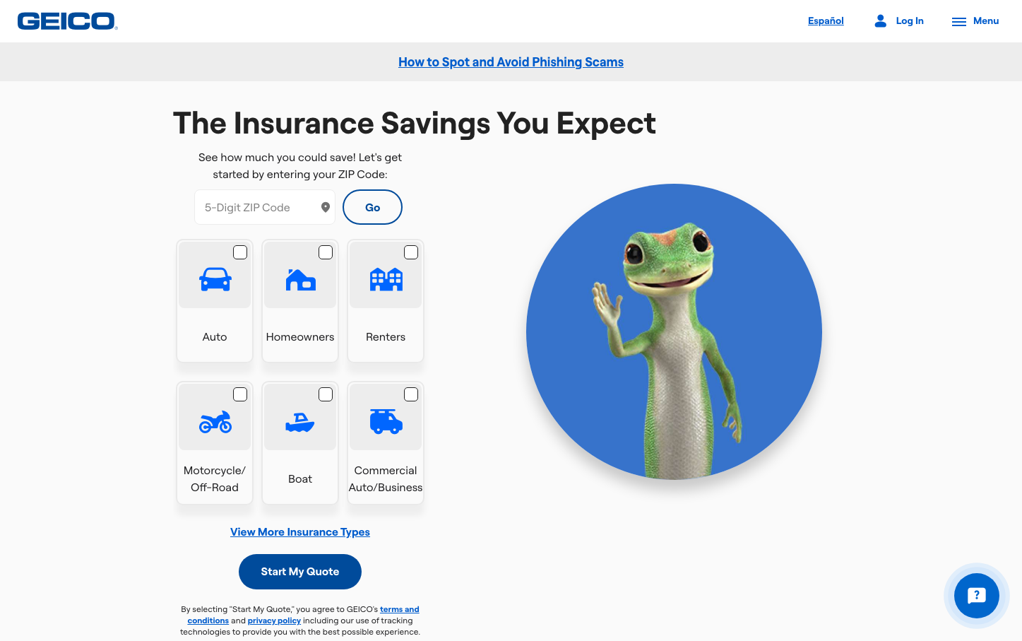
Geico
InsurtechGEICO's brand aesthetic centers around approachable insurance expertise with a warm, trust-building blue palette and their iconic gecko mascot creating an immediately recognizable friendly authority. The design balances professional credibility with accessibility through generous whitespace, clear hierarchical typography, and the gecko's welcoming presence that transforms insurance from intimidating to approachable.
Design Identity
Signature Color
GEICO Trust Blue
#0066cc
Reliable insurance protection with approachable expertise
Visual Identity
The circular gecko mascot waving in a blue gradient circle - this distinctive character-in-circle treatment with the friendly gesture is instantly recognizable as GEICO's signature visual element.
Component Style
Clean rounded rectangles with subtle borders and generous padding. Interactive elements use the signature blue with smooth curves (moderate border radius around 8-12px). Cards have light gray backgrounds with minimal shadows, emphasizing content over decorative effects.
Spacing Philosophy
Generous vertical spacing creates breathing room around key sections, with the gecko mascot getting ample whitespace to command attention. Form elements are well-spaced for easy interaction while maintaining visual connection through consistent 16-24px gaps.
Design Principles
- Typography uses only GEICO Roobert with clear weight hierarchy: 400 for body, 700 for headings
- Primary blue (#0066cc) dominates interactive elements and key focal points
- Icon grids use consistent sizing and spacing with checkbox selection states
- Gecko mascot always appears in circular frame with gradient blue background
- Form inputs maintain consistent padding and border radius around 8px
Target Audience
Everyday consumers seeking straightforward insurance solutions who value trustworthy service over complex financial jargon
Mood
Design descriptions are AI-generated based on visual analysis and may not fully reflect the brand's official design guidelines.
Design System
Typography Scale
| Element | Font | Size | Weight | Line Height |
|---|---|---|---|---|
| body | 16px | 400 | 22.4px | |
| h1 | 44px | 700 | normal | |
| h2 | 36px | 700 | 43.2px | |
| h3 | 28px | 700 | 32.2px | |
| h4 | 20px | 700 | 24px | |
| p | 16px | 400 | 24px | |
| a | 16px | 700 | 22.4px | |
| button | 24px | 400 | 24px | |
| input | 16px | 400 | normal | |
| nav | 16px | 400 | 22.4px |
Color Palette
#0066cc#ffffff