Help us build this. Leave comments, suggest improvements, and help create better design documentation for agents.
Greylock
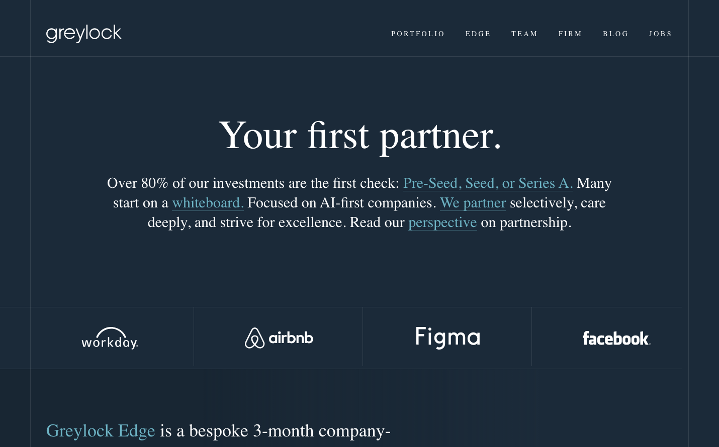
FinanceGreylock embodies sophisticated venture capital gravitas with a midnight navy backdrop that evokes late-night founder conversations and boardroom confidentiality. The Miller Display serif headlines create an editorial luxury reminiscent of financial publications, while the constellation of portfolio logos floats like prestigious trophies in the darkness.
Design Identity
Signature Color
Midnight Navy
#2c3e50
venture capital authority and late-night startup hustle - serious money with understated confidence
Visual Identity
The dramatic dark canvas with floating white serif typography and carefully spaced portfolio logos - it's immediately recognizable as premium VC territory where major deals happen in shadows.
Component Style
Invisible UI philosophy - no buttons, borders, or cards visible. Everything dissolves into the dark background with only typography and logos maintaining presence through careful opacity and spacing.
Spacing Philosophy
Cathedral-like breathing room with massive vertical gaps between content blocks. Portfolio logos get equal real estate like precious artifacts in a gallery, while text floats in generous negative space.
Design Principles
- Dark backgrounds dominate 90% of visual space
- Typography hierarchy uses serif for impact, sans-serif for utility
- No visible UI chrome - buttons and forms blend invisibly
- Portfolio logos maintain equal visual weight regardless of brand size
- Hyperlinks use muted blue (#4a90a4) to avoid disrupting the monochrome mood
Target Audience
Series A+ founders and LP investors who prefer understated wealth signals over flashy startup aesthetics
Mood
Design descriptions are AI-generated based on visual analysis and may not fully reflect the brand's official design guidelines.
Design System
Typography Scale
| Element | Font | Size | Weight | Line Height |
|---|---|---|---|---|
| body | 16px | 400 | 24px | |
| h1 | 80px | 400 | 88px | |
| h2 | 36px | 400 | 46.8px | |
| h3 | 36px | 400 | 46.8px | |
| h5 | 14px | 400 | 15.4px | |
| p | 30px | 400 | 39px | |
| a | 16px | 400 | 24px | |
| button | 0px | 400 | 0px | |
| input | 16px | 400 | 24px | |
| header | 16px | 400 | 24px |
Color Palette
#7a00df#007cba#006ba1#005a87#000000#abb8c3#ffffff#f78da7#cf2e2e#ff6900#fcb900#7bdcb5