Help us build this. Leave comments, suggest improvements, and help create better design documentation for agents.
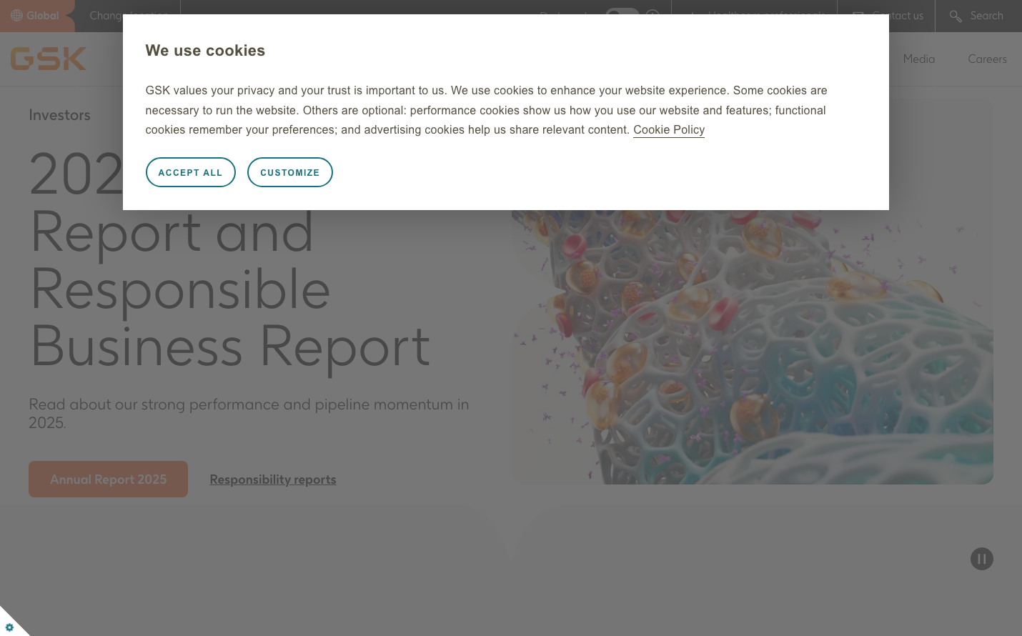
GSK
HealthcareGSK employs a distinctive pharmaceutical-grade aesthetic that balances institutional authority with human approachability. The typography system uses custom GSK fonts with dramatically varied scales - massive 80px headlines contrasted with delicate 14px body text - creating a hierarchy that feels both scientific and accessible. The warm coral-orange primary button against neutral backgrounds suggests healthcare warmth while maintaining corporate credibility.
Design Identity
Signature Color
GSK Healthcare Orange
#E17B47
pharmaceutical warmth and human-centered healthcare innovation
Visual Identity
The extreme typographic scale contrast - from whisper-thin 14px body text to bold 80px headers - combined with generous whitespace and coral accent touches creates an unmistakably clinical yet approachable feeling.
Component Style
Buttons have soft rounded corners with warm coral backgrounds and clean sans-serif typography. Cards and containers use minimal styling with subtle shadows and plenty of breathing room. Form elements are oversized (40px font) suggesting accessibility-first design thinking.
Spacing Philosophy
Generous, clinical spacing that mirrors pharmaceutical packaging design - lots of negative space to convey trust and precision, with content grouped in clear hierarchical blocks that feel both authoritative and digestible.
Design Principles
- Typography scales dramatically: 14px body to 80px headlines for clear hierarchy
- Custom GSK font family maintains brand consistency across all elements
- Warm coral accent color sparingly applied to key interactive elements
- Oversized form inputs (40px font) prioritize accessibility
- Minimal visual effects - relies on typography and space over decoration
Target Audience
Healthcare professionals, investors, and patients who expect pharmaceutical-grade credibility combined with human-centered accessibility
Mood
Design descriptions are AI-generated based on visual analysis and may not fully reflect the brand's official design guidelines.
Design System
Typography Scale
| Element | Font | Size | Weight | Line Height |
|---|---|---|---|---|
| body | 18px | 400 | 21.6px | |
| h1 | 22px | 400 | 24px | |
| h2 | 80px | 400 | 80px | |
| h3 | 18px | 400 | 24px | |
| p | 14px | 400 | 18px | |
| a | 18px | 400 | 21.6px | |
| button | 18px | 400 | 20.7px | |
| input | 40px | 400 | 52px | |
| nav | 15px | 400 | 18px | |
| header | 18px | 400 | 21.6px |
Color Palette
#007aff