Help us build this. Leave comments, suggest improvements, and help create better design documentation for agents.
Gympass
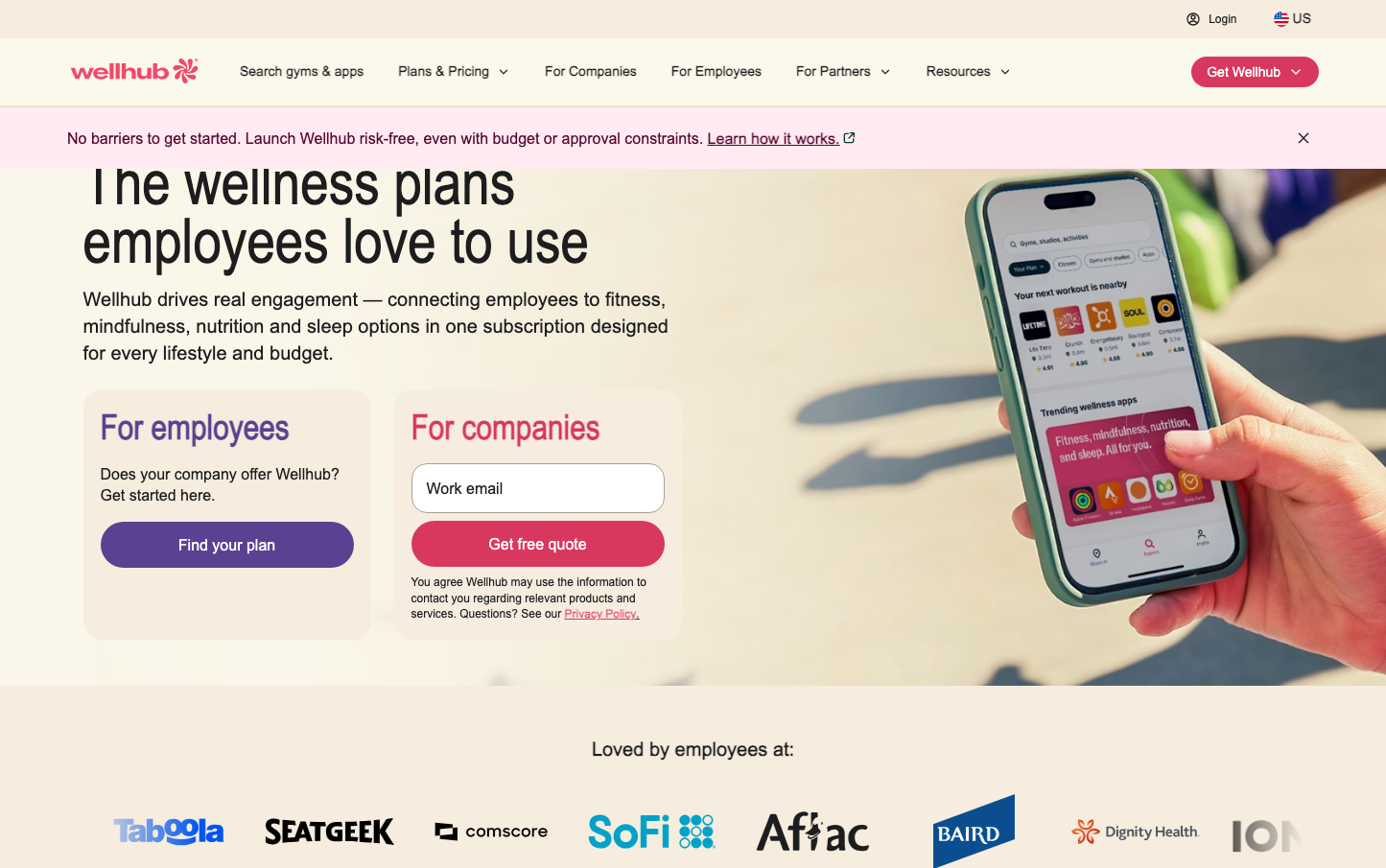
FitnessWellhub creates a vibrant, health-forward aesthetic that balances corporate wellness professionalism with consumer app energy. The coral-pink signature color suggests warmth and vitality while the condensed typography creates urgency and impact, positioning wellness as both accessible and essential.
Design Identity
Signature Color
Wellhub Coral
#FF4F6D
energetic wellness vitality - warmer than fitness red, more dynamic than healthcare blue
Visual Identity
The split-screen hero layout with phone mockup on right and dual-audience messaging on left creates an immediately recognizable B2B2C wellness platform structure that bridges employee and employer needs.
Component Style
Generous rounded corners (24px+ on buttons) with solid fills and no borders create approachable, app-like components. Buttons feel substantial with thick padding, while the overall treatment is friendly rather than corporate.
Spacing Philosophy
Asymmetrical layout with condensed left content and expansive right visual creates dynamic tension. Tight vertical rhythm in text blocks contrasts with generous whitespace around major sections.
Design Principles
- Headers use condensed typography at 64px for maximum impact in minimal space
- Button radius consistently 24px+ for friendly, app-like feel
- Split-screen layouts with 60/40 content-to-visual ratio
- Coral accent color reserved for primary actions only
- Phone mockups always show actual app interface for credibility
Target Audience
HR leaders and benefits managers at mid-to-large companies who need to demonstrate wellness ROI while ensuring high employee engagement rates
Mood
Design descriptions are AI-generated based on visual analysis and may not fully reflect the brand's official design guidelines.
Design System
Typography Scale
| Element | Font | Size | Weight | Line Height |
|---|---|---|---|---|
| body | 16px | 400 | 16px | |
| h1 | 64px | 400 | 60.8px | |
| h2 | 36px | 700 | 43.2px | |
| h3 | 36px | 700 | 43.2px | |
| p | 12px | 500 | 13.2px | |
| a | 12px | 500 | 13.2px | |
| button | 13.3333px | 400 | normal | |
| input | 14px | 500 | normal | |
| nav | 16px | 400 | 16px | |
| header | 16px | 400 | 16px |
Color Palette
No colors extracted


