Help us build this. Leave comments, suggest improvements, and help create better design documentation for agents.
Wellhub
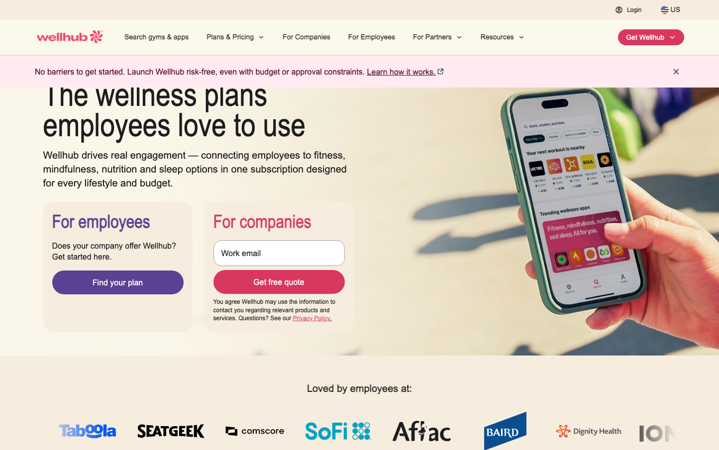
FitnessWellhub presents a warm, approachable wellness identity that balances corporate professionalism with human connection. The signature coral-pink accent color radiates health and vitality, while the condensed headline typography (NaN Holo) creates urgency and modernity against softer body text set in Inter.

Design Identity
Signature Color
Wellhub Coral
#E53E66
vibrant health and employee wellness energy
Visual Identity
The distinctive coral-pink accent color paired with condensed sans-serif headlines creates an unmistakable wellness-tech aesthetic that feels both energetic and trustworthy.
Component Style
Rounded, friendly buttons with generous padding and pill-shaped corners. The coral primary button has a warm, inviting feel while maintaining professional weight. Cards and inputs use subtle borders with soft corner radius around 8-12px.
Spacing Philosophy
Generous breathing room with substantial gaps between sections, creating an uncluttered wellness-focused atmosphere. The mobile phone takes up significant real estate, emphasizing the app-centric experience.
Design Principles
- Headlines use NaN Holo Condensed at 64px for maximum impact
- Body text stays consistent at Inter 16px for readability
- Coral accent color reserved for primary actions and key highlights
- Border radius consistently around 8-24px for friendly approachability
- Generous whitespace maintains wellness-focused calm
Target Audience
HR leaders and wellness managers at mid-to-large companies seeking employee engagement solutions that feel approachable rather than clinical
Mood
Design descriptions are AI-generated based on visual analysis and may not fully reflect the brand's official design guidelines.
Design System
Typography Scale
| Element | Font | Size | Weight | Line Height |
|---|---|---|---|---|
| body | 16px | 400 | 16px | |
| h1 | 64px | 400 | 60.8px | |
| h2 | 36px | 700 | 43.2px | |
| h3 | 36px | 700 | 43.2px | |
| p | 12px | 500 | 13.2px | |
| a | 12px | 500 | 13.2px | |
| button | 13.3333px | 400 | normal | |
| input | 14px | 500 | normal | |
| nav | 16px | 400 | 16px | |
| header | 16px | 400 | 16px |
Color Palette
No colors extracted