Help us build this. Leave comments, suggest improvements, and help create better design documentation for agents.
HashiCorp
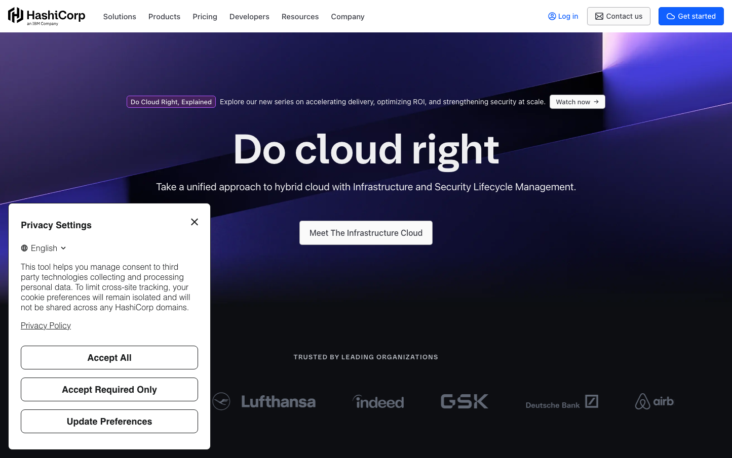
EnterpriseHashiCorp's brand radiates enterprise authority through a cosmic purple-to-blue gradient that transforms infrastructure complexity into visual poetry. The custom HashiCorp Sans typography, with its distinctive 82px headlines and precise 600-700 weights, commands attention while maintaining technical credibility in the developer ops space.
Design Identity
Signature Color
HashiCorp Infrastructure Blue
#4c67f9
Technical precision meets enterprise trust - the color of reliable cloud infrastructure
Visual Identity
The dramatic diagonal gradient sweep from deep purple (#552e87) to electric blue (#4c67f9) creating a cosmic, almost nebular atmosphere that makes infrastructure feel aspirational rather than mundane.
Component Style
Soft enterprise components with 5-6px border radius, subtle multi-layer shadows (low: 1-2px, mid: 8-16px blur), and generous 7-24px padding. Everything feels approachable yet substantial - never sharp, never flat.
Spacing Philosophy
Luxurious 88px block padding creates breathing room worthy of enterprise budgets, while 64px content spacing maintains rhythm. Internal components use tight 7-8px control padding for efficiency.
Design Principles
- Border radius stays between 3-6px for approachable professionalism
- Typography scales dramatically: 82px headlines, 52px subheads, 13-16px body
- Font weights are decisive: 600-700 for headers, 400-500 for body
- Shadows use multi-layer approach with #656a76 at varying opacities
- 88px vertical rhythm for major sections maintains enterprise gravitas
Target Audience
DevOps engineers and infrastructure architects at Series B+ companies who need enterprise-grade tools that don't sacrifice developer experience
Mood
Design descriptions are AI-generated based on visual analysis and may not fully reflect the brand's official design guidelines.
Design System
Typography Scale
| Element | Font | Size | Weight | Line Height |
|---|---|---|---|---|
| input | 16px | 400 | normal | |
| body | 16px | 400 | 26px | |
| h1 | 82px | 600 | 95.9974px | |
| h2 | 52px | 600 | 61.9996px | |
| h3 | 34px | 700 | 39.9976px | |
| p | 13px | 600 | 21.9999px | |
| a | 14px | 500 | 18px | |
| button | 13.3333px | 500 | normal | |
| nav | 16px | 500 | 27px | |
| header | 16px | 500 | 27px |
Color Palette
#000000#1d1e1f#343536#727274#bfbfc0#dbdbdc#f2f2f3#ffffff#0a0f32#101a59#1b2a83#4c67f9