Help us build this. Leave comments, suggest improvements, and help create better design documentation for agents.
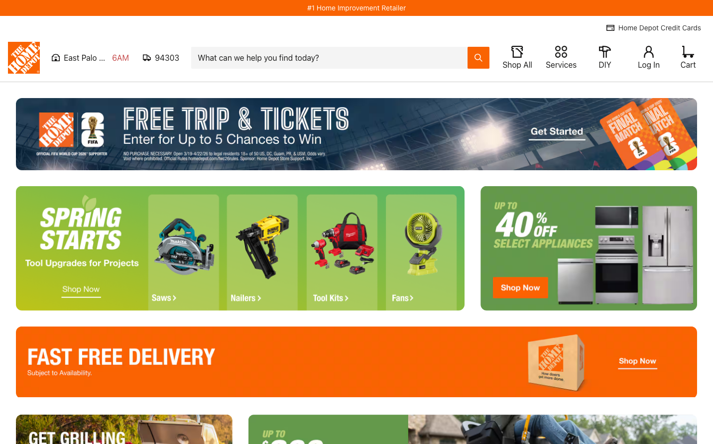
Home Depot
RetailHome Depot's brand radiates construction-site energy with its iconic orange paired with tactical blues and greens. The design feels like a well-organized warehouse - densely packed with promotional content yet systematically arranged for quick scanning by busy contractors and weekend warriors.
Design Identity
Signature Color
Home Depot Orange
#f96302
hands-on confidence and blue-collar expertise
Visual Identity
Dense promotional banners stacked vertically with high-contrast color blocking - orange commands attention while product imagery sits on saturated background panels that feel like aisle endcaps in a hardware store.
Component Style
Chunky rectangular buttons with minimal border radius, bold sans-serif typography, and high contrast color combinations. Everything feels sturdy and utilitarian - like tools built for heavy use rather than delicate precision.
Spacing Philosophy
Maximum information density with minimal breathing room - sections stack tightly with thin gaps, mimicking the efficient space utilization of a warehouse where every square foot counts.
Design Principles
- Orange always dominates as the primary CTA color
- Product imagery uses saturated background panels in green/blue ranges
- Helvetica Neue maintains consistency across all text elements
- Promotional banners span full width with minimal padding
- White text on colored backgrounds for maximum contrast
Target Audience
Professional contractors and serious DIY homeowners who value efficiency over aesthetics and need to quickly find specific tools and materials
Mood
Design descriptions are AI-generated based on visual analysis and may not fully reflect the brand's official design guidelines.
Design System
Typography Scale
| Element | Font | Size | Weight | Line Height |
|---|---|---|---|---|
| body | 14px | 400 | 21px | |
| h2 | 30px | 400 | 37.5px | |
| h3 | 24px | 400 | 30px | |
| h4 | 18px | 400 | 27px | |
| h5 | 18px | 400 | 22.5px | |
| p | 14px | 400 | 17.5px | |
| a | 14px | 400 | 21px | |
| button | 14px | 400 | 21px | |
| input | 16px | 400 | 20px |
Color Palette
#f96302#3b82f6#ffffff