Help us build this. Leave comments, suggest improvements, and help create better design documentation for agents.
ING
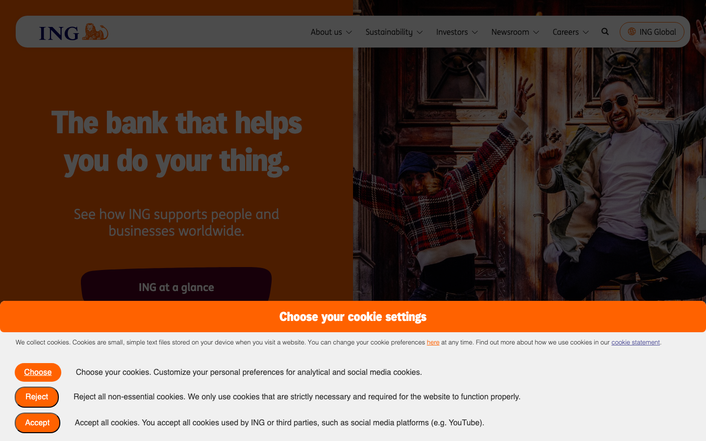
FinanceING's brand radiates approachable warmth through vibrant orange gradients paired with sophisticated purple accents, creating a confident yet human financial experience. The custom INGDisplay typography delivers bold, friendly messaging that breaks away from sterile banking conventions.
Design Identity
Signature Color
ING Orange
#FF6200
energetic optimism and financial empowerment - approachable banking that ignites possibilities
Visual Identity
The unmistakable orange-to-warm gradient backgrounds with bold, oversized typography create an instantly recognizable warmth that stands apart from traditional blue banking aesthetics.
Component Style
Soft, welcoming components with 8px border radius and rich gradient fills. Buttons feel substantial with generous padding and confident orange backgrounds, avoiding harsh edges or clinical styling.
Spacing Philosophy
Generous breathing room with large hero sections and comfortable text spacing that prioritizes readability and emotional comfort over density. The layout feels expansive and optimistic.
Design Principles
- Border radius consistently set to 8px for approachable softness
- Orange gradient (#FF6200 to warmer tones) dominates hero sections
- Typography scales dramatically: 64px headlines to 16px body for clear hierarchy
- Purple accent (#525199) provides sophisticated contrast to orange energy
- Shadow effects use rgba(21,21,21) for consistent depth without harshness
Target Audience
Everyday people and small business owners seeking a banking partner that feels human and empowering rather than intimidating or corporate
Mood
Design descriptions are AI-generated based on visual analysis and may not fully reflect the brand's official design guidelines.
Design System
Typography Scale
| Element | Font | Size | Weight | Line Height |
|---|---|---|---|---|
| body | 16px | 400 | 24px | |
| h1 | 64px | 400 | 77px | |
| h2 | 25.6px | 600 | 25px | |
| h3 | 44px | 400 | 52.8px | |
| h4 | 24px | 400 | 36px | |
| h5 | 16px | 700 | 22.4px | |
| h6 | 16px | 700 | 19.2px | |
| p | 13px | 30 | 20px | |
| a | 13px | 30 | 20px | |
| button | 16px | 500 | 20px |
Color Palette
#525199#ab0066#cccccc#ff6200#f0f0f0#151515#ff8133#cc4e00#ffffff#dee2e6#f6e5ef#a7a7a7