Help us build this. Leave comments, suggest improvements, and help create better design documentation for agents.
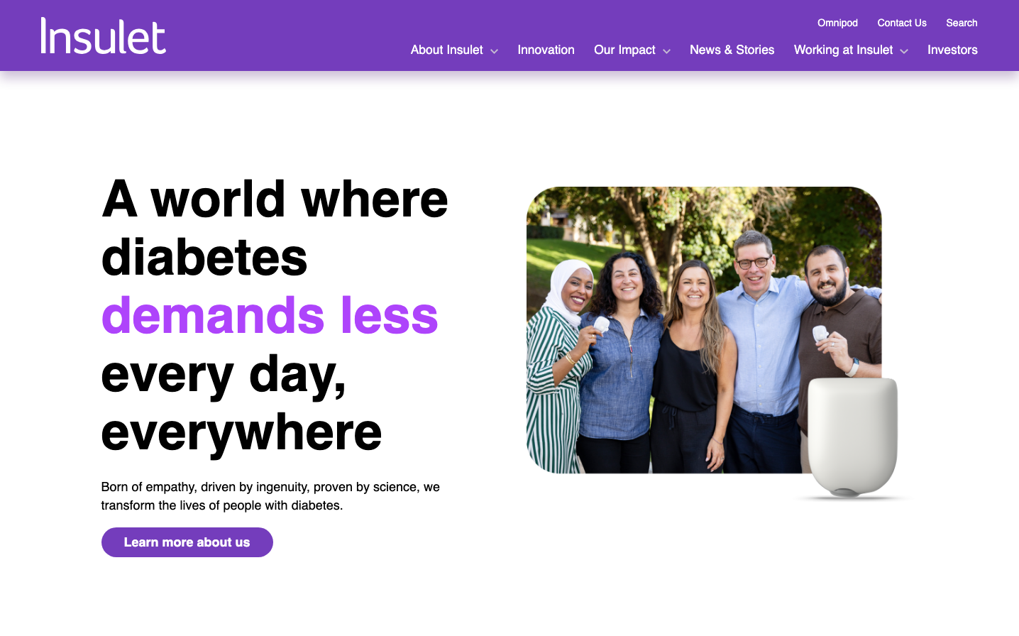
Insulet
HealthcareInsulet embodies warm healthcare optimism through its signature vibrant purple that feels approachable yet authoritative. The design balances personal connection with medical credibility, using generous whitespace and human-centered imagery to make diabetes management feel less clinical and more empowering.
Design Identity
Signature Color
Healthcare Purple
#8B4CB8
Medical innovation with human warmth - bridging clinical expertise with everyday life accessibility
Visual Identity
The distinctive purple-to-white gradient paired with authentic lifestyle photography of diverse people in natural settings, creating a healthcare brand that feels more like a supportive community than a medical company.
Component Style
Soft, approachable components with generous rounded corners (likely 8-12px radius) and subtle shadows. Buttons feel substantial but not heavy, with medium font weights that convey confidence without clinical coldness.
Spacing Philosophy
Breathing room philosophy - large gaps between major sections (60-80px) create emotional space, while the split-screen layout dedicates equal visual weight to copy and human imagery, reinforcing the people-first approach.
Design Principles
- Purple dominates as the primary brand color across all interactive elements
- Typography uses only bold weights (700) for headlines and medium (500) for buttons
- Human photography always shows multiple people in natural, non-clinical settings
- Whitespace ratios favor generous padding - at least 40px around major text blocks
- Color hierarchy: Purple for primary actions, black for headlines, gray for body text
Target Audience
Adults living with diabetes who want technology that integrates seamlessly into their active, social lives rather than defining them by their condition
Mood
Design descriptions are AI-generated based on visual analysis and may not fully reflect the brand's official design guidelines.
Design System
Typography Scale
| Element | Font | Size | Weight | Line Height |
|---|---|---|---|---|
| body | 17.4645px | 400 | 23.25px | |
| h1 | 50px | 700 | 62px | |
| h2 | 41.9485px | 700 | 43.6875px | |
| h3 | 33.6884px | 700 | 37.4219px | |
| h4 | 27.0587px | 700 | 28.9531px | |
| p | 72px | 700 | 82px | |
| a | 17.4645px | 400 | 23.25px | |
| button | 17.4645px | 500 | 28px | |
| nav | 17.4645px | 400 | 23.25px | |
| header | 17.4645px | 400 | 23.25px |
Color Palette
No colors extracted