Help us build this. Leave comments, suggest improvements, and help create better design documentation for agents.
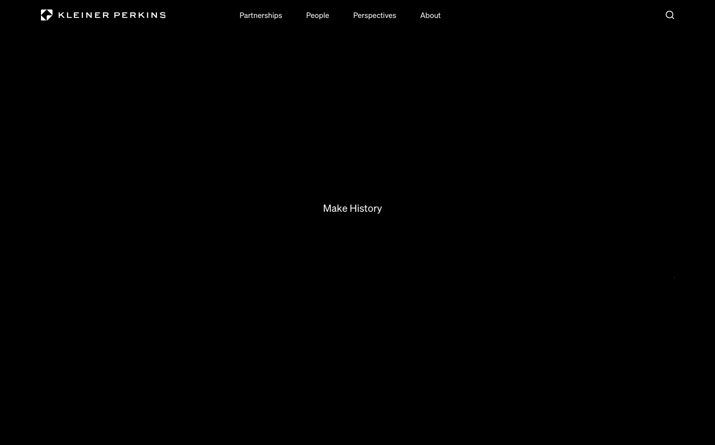
Kleiner Perkins
FinanceKleiner Perkins employs a radically minimal design centered on stark black and white contrast with the Söhne typeface creating an intellectual, gallery-like atmosphere. The design philosophy prioritizes content over decoration, using dramatic negative space and subtle typography to project understated authority.
Design Identity
Signature Color
Venture Black
#000000
Authoritative sophistication and elite venture capital exclusivity
Visual Identity
The almost brutal use of negative space combined with whisper-thin typography creates an unmistakable sense of confident restraint - like a private equity firm's minimalist boardroom.
Component Style
Components appear to float weightlessly with no visible borders or shadows, relying purely on typography hierarchy and spacing for definition. Everything feels intentionally understated with surgical precision.
Spacing Philosophy
Generous breathing room dominates with vast expanses of white space creating a sense of luxury and exclusivity. Elements are given dramatic distance from each other, suggesting confidence in every word.
Design Principles
- Typography weight never exceeds 400 - everything remains optically light
- Only two colors exist: pure black (#000000) and pure white (#ffffff)
- Font sizes stay minimal: 14px, 15px, and 20px maximum
- No shadows or effects - pure flat design
- Söhne typeface exclusively across all elements
Target Audience
Elite venture capital partners and unicorn startup founders who value intellectual gravitas over flashy marketing
Mood
Design descriptions are AI-generated based on visual analysis and may not fully reflect the brand's official design guidelines.
Design System
Typography Scale
| Element | Font | Size | Weight | Line Height |
|---|---|---|---|---|
| body | 14px | 400 | 19.6px | |
| h2 | 20px | 400 | 22.4px | |
| h3 | 14px | 400 | 19.6px | |
| p | 20px | 400 | 22.4px | |
| a | 14px | 400 | 19.6px | |
| button | 14px | 400 | 19.6px | |
| input | 14px | 400 | 19.6px | |
| nav | 15px | 400 | 20px | |
| header | 14px | 400 | 19.6px | |
| footer | 14px | 400 | 19.6px |
Color Palette
#ffffff#000000