Help us build this. Leave comments, suggest improvements, and help create better design documentation for agents.
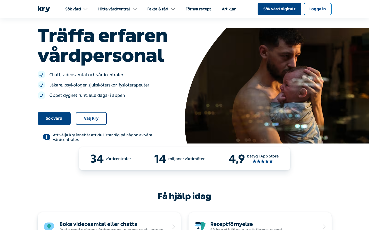
Kry
HealthcareKry's brand exudes clinical trust through deep ocean blues paired with warm, intimate photography. The ultra-bold typography creates commanding presence while soft, rounded elements convey approachability in healthcare.
Design Identity
Signature Color
Healthcare Navy
#1B5A96
Medical authority and digital trust - the deep blue of expertise
Visual Identity
Extreme typographic weight contrast - featherweight body text (400) against ultra-black headlines (900) creates a distinctive medical authority hierarchy that's instantly recognizable.
Component Style
Soft, rounded buttons with generous padding and no harsh shadows. Everything feels approachable yet substantial - like medical equipment designed for comfort. Buttons have gentle curves around 6-8px radius.
Spacing Philosophy
Breathing room philosophy - wide gutters between content blocks create calm, clinical spacing. Tight internal component padding keeps interactions intimate while generous section gaps prevent overwhelm.
Design Principles
- Typography weight jumps dramatically: 400 for body, 900 for headlines - no middle ground
- All interactive elements use 6-8px border radius for approachable medical feel
- Blue dominates structure while warm photography humanizes the experience
- Headlines use 70px at 900 weight for commanding medical authority
- Body text stays light at 400 weight for easy clinical reading
Target Audience
Health-conscious digital natives who value medical expertise but expect consumer-grade user experience - professionals who want clinical quality with app-like convenience.
Mood
Design descriptions are AI-generated based on visual analysis and may not fully reflect the brand's official design guidelines.
Design System
Typography Scale
| Element | Font | Size | Weight | Line Height |
|---|---|---|---|---|
| body | 20px | 400 | normal | |
| h1 | 70px | 900 | 77px | |
| h2 | 32px | 900 | 41.6px | |
| h3 | 22px | 700 | 28.6px | |
| p | 15px | 400 | 22.5px | |
| a | 16px | 500 | normal | |
| button | 15px | 700 | normal | |
| input | 16px | 400 | 16px | |
| nav | 20px | 400 | normal | |
| header | 20px | 400 | normal |
Color Palette
No colors extracted