Help us build this. Leave comments, suggest improvements, and help create better design documentation for agents.
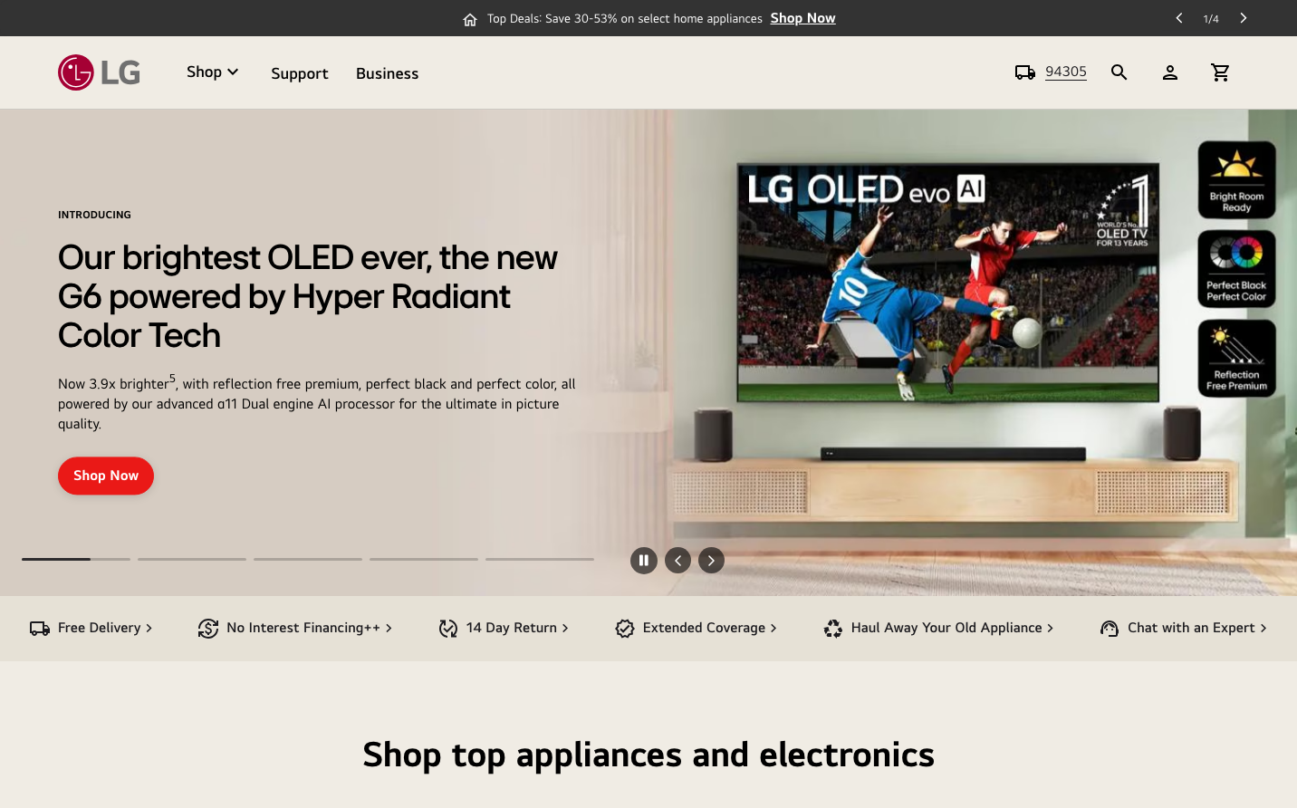
LG
Consumer ElectronicsLG's brand identity balances premium technology storytelling with approachable warmth through dramatic product showcases and custom LGEI typography. The aesthetic emphasizes visual-first communication where large hero imagery dominates, supported by clean technical copy that positions products as lifestyle solutions rather than mere appliances.
Design Identity
Signature Color
LG Crimson Red
#A50E2D
Bold innovation energy and Korean brand heritage that cuts through tech industry blues
Visual Identity
Dramatic full-width product photography with lifestyle contexts, always showing the product in aspirational living spaces rather than sterile studio shots, combined with confident sans-serif headlines that lead with emotional benefits over technical specs.
Component Style
Rounded rectangular buttons with substantial padding, clean pill-shaped elements for navigation, and soft-edged cards that feel approachable rather than clinical. Everything has gentle curves (8-12px radius) that humanize the tech-forward content.
Spacing Philosophy
Generous whitespace around hero content creates luxury breathing room, while compact service strip elements maintain practical density. The rhythm alternates between expansive showcase sections and condensed informational areas.
Design Principles
- Headlines always lead with emotional benefits before technical specifications
- Product imagery must show lifestyle context, never isolated on white backgrounds
- Red accent color used sparingly for primary actions only
- Typography hierarchy jumps dramatically from 40px headlines to 18px body
- All interactive elements use 8px+ border radius for approachable feel
Target Audience
Affluent homeowners aged 30-55 who view appliances as lifestyle investments and value design integration over pure technical performance
Mood
Design descriptions are AI-generated based on visual analysis and may not fully reflect the brand's official design guidelines.
Design System
Typography Scale
| Element | Font | Size | Weight | Line Height |
|---|---|---|---|---|
| body | 18px | 400 | 24.84px | |
| h1 | 40px | 500 | 43.2px | |
| h2 | 40px | 500 | 43.2px | |
| p | 14px | 400 | 19.32px | |
| a | 18px | 400 | 24.84px | |
| button | 18px | 700 | 18px | |
| input | 13.3333px | 400 | normal | |
| header | 18px | 400 | 24.84px |
Color Palette
No colors extracted