Help us build this. Leave comments, suggest improvements, and help create better design documentation for agents.
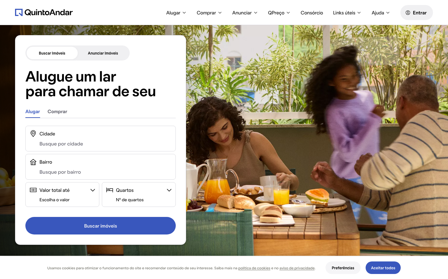
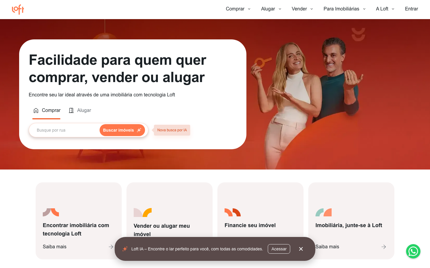
Loft
ProptechLoft creates a warm, approachable real estate platform using a vibrant coral-to-crimson gradient that radiates energy and optimism. The Inter typography maintains professional credibility while the rounded, generous components feel welcoming rather than corporate, suggesting real estate made human.
Design Identity
Signature Color
Loft Coral
#FF6B47
Warm accessibility and residential comfort - real estate that feels like home, not business
Visual Identity
The distinctive coral-orange gradient background with prominent rounded white content cards creates an immediately recognizable 'warm tech' aesthetic that stands apart from typical blue-heavy fintech competitors.
Component Style
Soft rounded corners (12-16px radius) with generous white cards floating over gradient backgrounds. Buttons are pill-shaped with substantial padding, creating a friendly, approachable feel rather than sharp corporate precision.
Spacing Philosophy
Generous breathing room with large content cards given ample whitespace. The hero section uses expansive padding to create a sense of openness, while internal component spacing remains comfortable but not excessive.
Design Principles
- Gradient backgrounds always transition from coral to deeper crimson
- Content cards are always white with 12-16px border radius
- Icons use simple geometric shapes with rounded edges
- Typography hierarchy uses bold 700 weight for all headers
- Buttons maintain pill-shape aesthetic with high padding ratios
Target Audience
Brazilian millennials and Gen-X looking to buy, sell, or rent residential properties who value technology but want a human, non-intimidating experience
Mood
Design descriptions are AI-generated based on visual analysis and may not fully reflect the brand's official design guidelines.
Design System
Typography Scale
| Element | Font | Size | Weight | Line Height |
|---|---|---|---|---|
| body | 16px | 400 | 25.1429px | |
| h1 | 48px | 700 | 57.6px | |
| h2 | 48px | 700 | 60px | |
| h3 | 18px | 700 | 28px | |
| p | 16px | 400 | 24px | |
| a | 16px | 400 | 25.1429px | |
| button | 16px | 400 | 18.4px | |
| input | 14px | 400 | 24px | |
| nav | 16px | 400 | 25.1429px | |
| header | 16px | 400 | 25.1429px |
Color Palette
No colors extracted