Help us build this. Leave comments, suggest improvements, and help create better design documentation for agents.
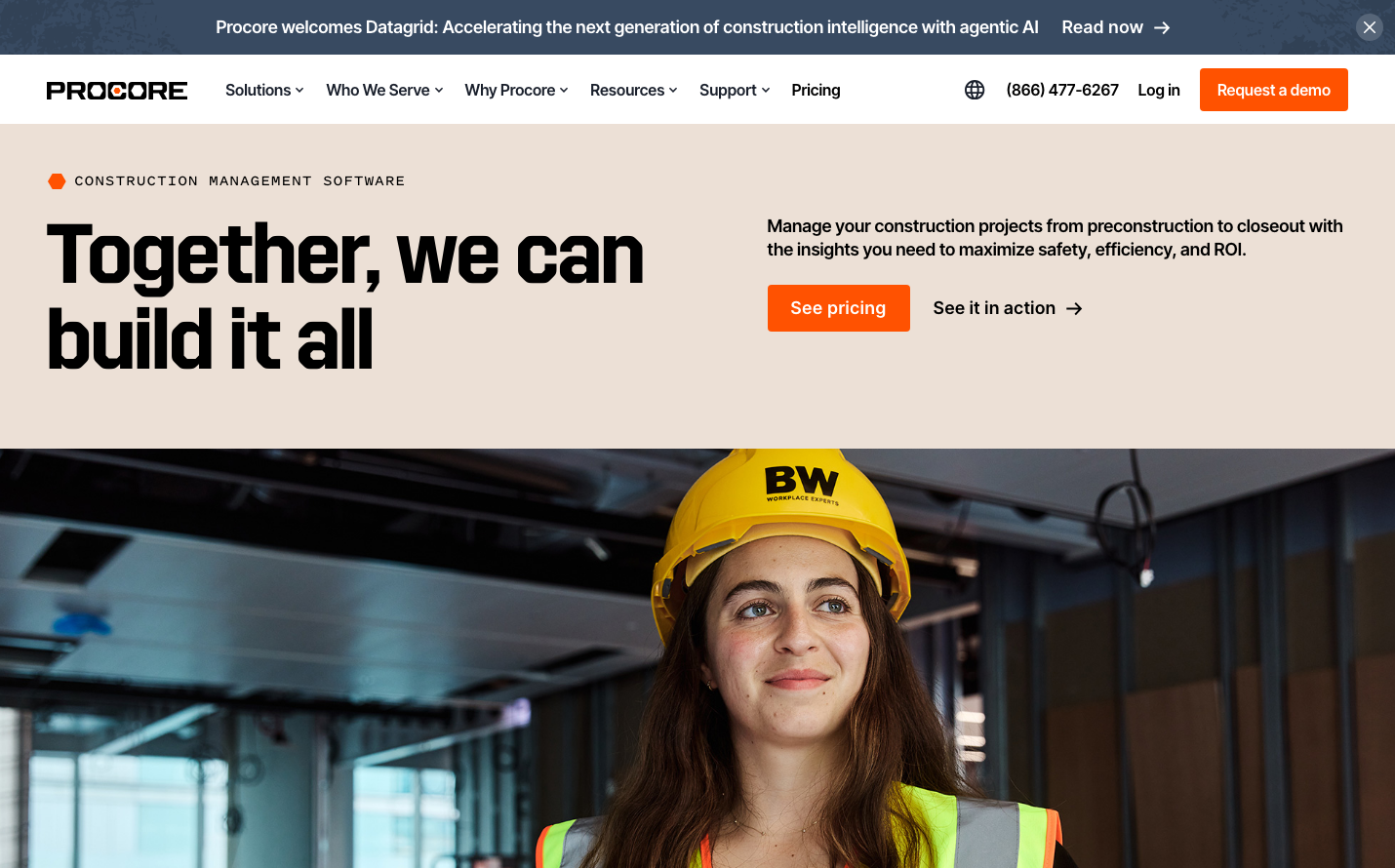
Procore
ProptechProcore embodies industrial confidence through bold construction orange paired with professional dark grays. The typography system balances the technical precision of Inter Tight with Pitch Sans headings, creating a trustworthy yet approachable aesthetic for construction professionals who demand both power and reliability.
Design Identity
Signature Color
Construction Orange
#ed8936
Industrial energy and construction site visibility - communicating action, safety, and professional expertise
Visual Identity
The bold construction orange CTA buttons against neutral backgrounds create an unmistakable construction-industry aesthetic - like safety equipment and warning signs translated into software design.
Component Style
Rounded corner buttons (approximately 6-8px radius) with solid fills and no visible shadows. The orange primary buttons feel substantial and construction-grade, while maintaining software polish through clean typography and proper padding.
Spacing Philosophy
Generous whitespace creates breathing room around content blocks, with the hero section using substantial vertical padding. The layout feels spacious and uncluttered, allowing the construction worker image to dominate the right half of the screen.
Design Principles
- Orange CTA buttons always use #ed8936 for maximum visibility
- Typography mixes Inter Tight body text with Pitch Sans headings
- Button corner radius stays between 6-8px for approachable professionalism
- Dark text (#1a202c) ensures construction-site readability
- Minimal shadows - components rely on color and typography for hierarchy
Target Audience
Construction project managers and field supervisors who need software that feels as reliable and straightforward as their hard hats and tools
Mood
Design descriptions are AI-generated based on visual analysis and may not fully reflect the brand's official design guidelines.
Design System
Typography Scale
| Element | Font | Size | Weight | Line Height |
|---|---|---|---|---|
| body | 16px | 400 | 24px | |
| h1 | 16px | 500 | 20px | |
| h2 | 16px | 600 | 20px | |
| h3 | 18px | 600 | 24px | |
| h4 | 24px | 600 | 32px | |
| p | 18px | 600 | 24px | |
| a | 18px | 600 | 24px | |
| button | 12px | 400 | 18px | |
| nav | 16px | 400 | 24px | |
| header | 16px | 400 | 24px |
Color Palette
#ed8936#0d4d71#1a202c#171923#e6fffa#38b2ac#a12b2f#faf5ff#ece0d6#3182ce#002c5c#285e61