Help us build this. Leave comments, suggest improvements, and help create better design documentation for agents.
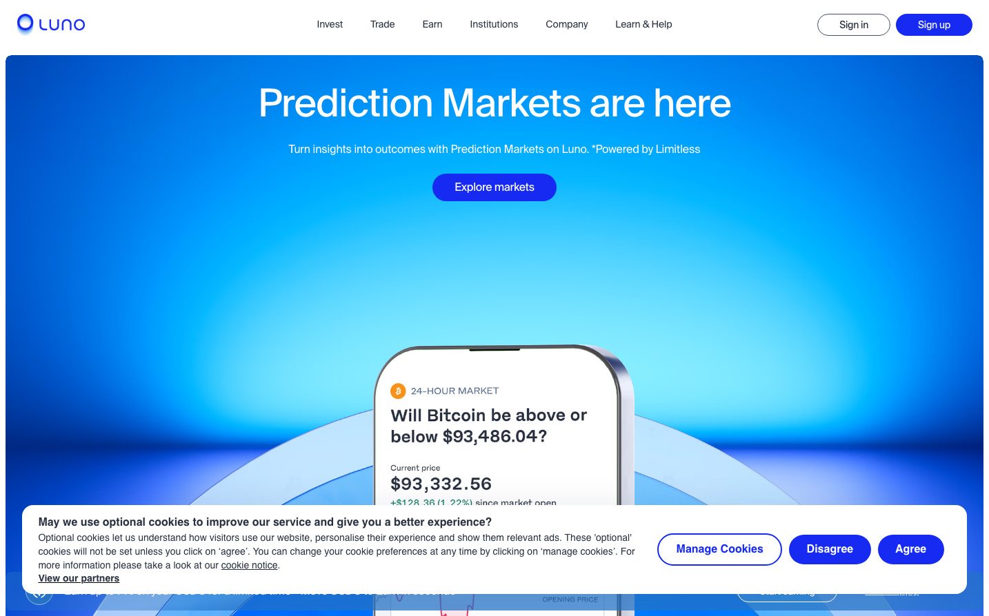
Luno
CryptoLuno's brand radiates crypto-native confidence through its signature electric blue gradient that transitions from deep royal to luminous cyan, creating an almost holographic depth. The typography hierarchy using Suisse Int'l Book creates a sophisticated Swiss-inspired foundation that whispers precision while the dynamic gradient background screams innovation and digital wealth.
Design Identity
Signature Color
Luno Electric Blue
#2B5CE6
Crypto-native optimism and digital wealth acceleration - the color of liquid financial opportunity
Visual Identity
The unmistakable deep-to-light blue gradient background that creates an immersive, almost underwater feeling of diving deep into crypto markets. This oceanic gradient treatment is instantly recognizable and creates a sense of depth and movement unique to Luno.
Component Style
Pill-shaped buttons with generous corner radius and solid fills, no visible borders or shadows. The primary CTA uses a deeper blue that stands out against the gradient while maintaining harmony. Components feel weightless and floating, as if suspended in the gradient atmosphere.
Spacing Philosophy
Expansive vertical breathing room with the hero content floating in abundant whitespace against the gradient. The phone mockup is given dramatic negative space to create focus, while the cookie banner demonstrates tight internal padding that prioritizes content density over luxury spacing.
Design Principles
- Gradients always flow from deep blue to light blue creating depth
- Typography uses only Suisse Int'l variants for headings, Work Sans for body text
- Corner radius on interactive elements is generous (24px+) for pill effects
- White text always floats over blue backgrounds for maximum contrast
- Mockups and devices are presented at dramatic angles for dynamic energy
Target Audience
Crypto-forward millennials and Gen Z who see digital assets as their path to financial freedom and want a platform that feels as dynamic and future-focused as their investment strategy
Mood
Design descriptions are AI-generated based on visual analysis and may not fully reflect the brand's official design guidelines.
Design System
Typography Scale
| Element | Font | Size | Weight | Line Height |
|---|---|---|---|---|
| body | 12px | 400 | normal | |
| h2 | 56px | 400 | 61.6px | |
| h3 | 48px | 400 | 52.8px | |
| h4 | 32px | 400 | 35.2px | |
| h6 | 14px | 400 | 14px | |
| p | 14px | 400 | 20px | |
| a | 14px | 400 | 20px | |
| button | 11.7px | 600 | 18px | |
| nav | 12px | 400 | normal | |
| footer | 12px | 400 | normal |
Color Palette
No colors extracted