Help us build this. Leave comments, suggest improvements, and help create better design documentation for agents.
MAC
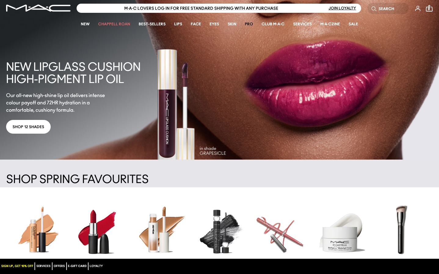
BeautyMAC's brand exudes theatrical glamour with a bold, editorial aesthetic that treats makeup as high fashion. The deep plum and burgundy palette creates an atmosphere of luxurious rebellion, while the custom 'ano' typography adds architectural precision to counter the sensual product imagery.
Design Identity
Signature Color
MAC Plum
#6B1B47
Sophisticated rebellion and theatrical confidence - the color of makeup artistry elevated to high fashion
Visual Identity
Dramatic close-up photography with intense color saturation, featuring lips and skin as the hero elements against minimal white backgrounds with sparse, architectural typography
Component Style
Clean rectangular buttons with sharp corners and no shadows, maintaining focus on the dramatic product imagery. Typography-driven navigation with minimal visual weight to let the photography dominate.
Spacing Philosophy
Generous negative space creates breathing room around hero imagery, with tight 8-12px padding on interactive elements to maintain the clean, editorial layout that feels more like a fashion magazine than traditional e-commerce
Design Principles
- Product photography always dominates with 60%+ of viewport space
- Typography uses only ano_regular custom font family for brand consistency
- Buttons maintain 15px font size with minimal padding for understated presence
- No drop shadows or heavy effects - flat design keeps focus on imagery
- White backgrounds create stark contrast with saturated lip colors
Target Audience
Makeup artists, beauty enthusiasts, and fashion-forward individuals who view cosmetics as tools for creative expression rather than basic beauty products
Mood
Design descriptions are AI-generated based on visual analysis and may not fully reflect the brand's official design guidelines.
Design System
Typography Scale
| Element | Font | Size | Weight | Line Height |
|---|---|---|---|---|
| body | 15px | 400 | 18.75px | |
| h2 | 36px | 400 | 40px | |
| h3 | 24px | 400 | 28px | |
| h4 | 18px | 700 | 18px | |
| h5 | 14px | 700 | 18px | |
| p | 12px | 700 | 32px | |
| a | 15px | 400 | 18.75px | |
| button | 15px | 400 | 18.75px | |
| input | 15px | 400 | 18.75px | |
| header | 15px | 400 | 18.75px |
Color Palette
#ffffff#3b82f6