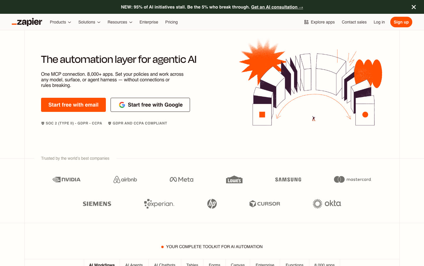
Help us build this. Leave comments, suggest improvements, and help create better design documentation for agents.
Mollie
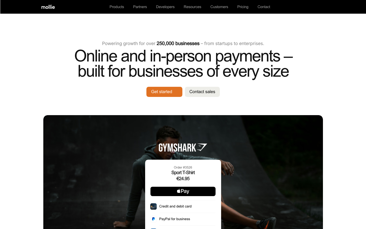
FintechMollie's brand exudes trustworthy fintech sophistication through its distinctive orange CTA against a monochromatic palette of whites and grays. The typography tells a story of accessible professionalism - Inter's geometric forms scaled from massive 60px headlines to precise 15px body text create a sense of scalable reliability that mirrors their business proposition.
Design Identity
Signature Color
Mollie Orange
#FF6200
Energetic payment confidence - stands out in the sea of blue fintech while maintaining enterprise trustworthiness
Visual Identity
The dramatic scale contrast between massive ultra-light headlines (60px at 400 weight) and the strategic use of vibrant orange as the sole accent color against a grayscale foundation - creating a payments interface that feels both authoritative and approachable
Component Style
Softly rounded corners (approximately 8px) with clean fills and no visible borders or shadows. The primary orange button has substantial padding creating a confident, clickable presence, while the secondary button maintains the same proportions with a transparent treatment and subtle gray text.
Spacing Philosophy
Generous vertical rhythm with substantial gaps between major sections, allowing the massive headlines to breathe. Tight, purposeful spacing within components maintains focus while the overall layout uses whitespace to create a sense of premium simplicity.
Design Principles
- Typography scale jumps dramatically: 60px headlines to 15px body with no intermediate sizes
- Orange used exclusively for primary actions - no other accent colors compete
- Button corner radius consistently around 8px across all interactive elements
- Inter font family used exclusively with weights of 400 and 600 only
- Monochromatic base with single color accent maintains visual hierarchy
Target Audience
Business owners and financial decision-makers who need payment solutions that scale from startup simplicity to enterprise complexity - valuing clarity over flashiness
Mood
Design descriptions are AI-generated based on visual analysis and may not fully reflect the brand's official design guidelines.
Design System
Typography Scale
| Element | Font | Size | Weight | Line Height |
|---|---|---|---|---|
| body | 12px | 400 | normal | |
| h1 | 60px | 400 | 60px | |
| h2 | 18px | 600 | 25.2px | |
| h3 | 42px | 400 | 46.2px | |
| p | 15px | 500 | 19.5px | |
| a | 12px | 400 | normal | |
| button | 12px | 400 | normal | |
| nav | 12px | 400 | normal | |
| footer | 12px | 400 | normal |
Color Palette
No colors extracted