Help us build this. Leave comments, suggest improvements, and help create better design documentation for agents.
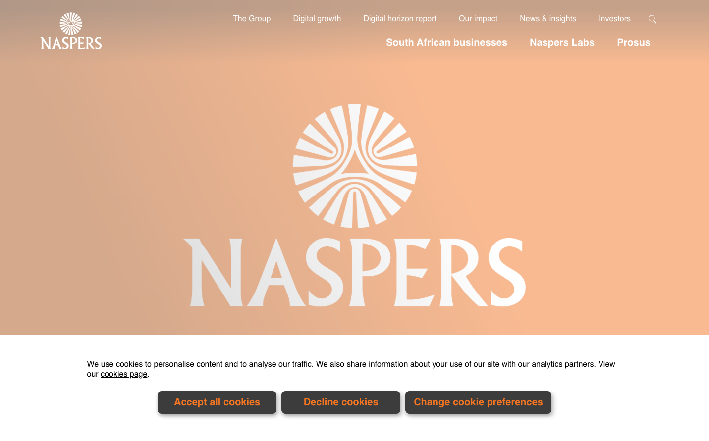
Naspers
TechNaspers employs a warm, approachable aesthetic with a signature peach-salmon background that creates an envelope of comfort and optimism. The typography uses Neuzeit Grotesk with bold, confident weights that suggest corporate reliability while remaining human and accessible.
Design Identity
Signature Color
Naspers Peach
#E8B8A0
warmth, approachability, and human-centered technology investment
Visual Identity
The distinctive radiating sunburst logo pattern combined with warm peach-toned backgrounds creates an immediately recognizable identity that feels both corporate and welcoming.
Component Style
Clean, minimal components with subtle rounded corners and soft shadows (0px 0px 16px rgba(0, 0, 0, 0.15)). Navigation elements are weightless and floating, with generous white text on warm backgrounds creating a premium yet approachable feel.
Spacing Philosophy
Generous breathing room with the logo prominently centered and ample whitespace around navigation elements. The layout feels airy and uncluttered, suggesting confidence and premium positioning.
Design Principles
- Typography uses only Neuzeit Grotesk across all elements
- Shadows are consistently soft with 15% opacity black
- Button text uses 19.97px with 700 weight for prominence
- Navigation maintains generous horizontal spacing
- Warm peach backgrounds create emotional connection
Target Audience
Global technology investors and portfolio companies seeking a human-centered investment partner with corporate gravitas
Mood
Design descriptions are AI-generated based on visual analysis and may not fully reflect the brand's official design guidelines.
Design System
Typography Scale
| Element | Font | Size | Weight | Line Height |
|---|---|---|---|---|
| body | 15.9765px | 400 | 22px | |
| h1 | 71.6952px | 700 | 80px | |
| h2 | 71.6952px | 700 | 80px | |
| h4 | 30px | 700 | 45px | |
| p | 16px | 500 | 20px | |
| a | 12px | 900 | 16px | |
| button | 19.9673px | 700 | 28px | |
| input | 25px | 400 | 40px | |
| nav | 15.9765px | 400 | 22px | |
| header | 15.9765px | 400 | 22px |
Color Palette
#9c1f86#3f3f3f