Help us build this. Leave comments, suggest improvements, and help create better design documentation for agents.
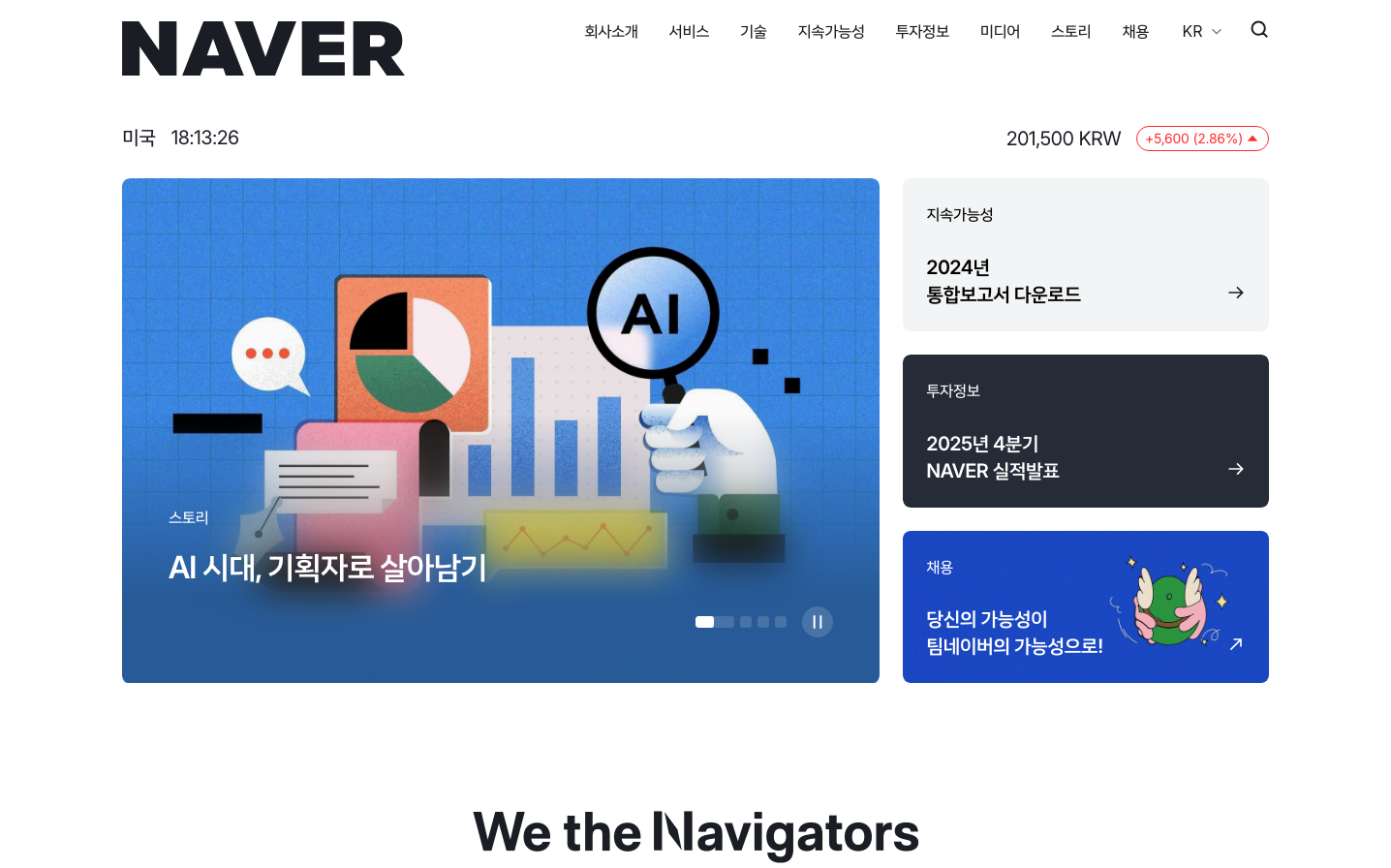
Naver
TechNaver presents a confident, information-dense ecosystem that balances professional authority with approachable accessibility. The design emphasizes structured data presentation through geometric iconography and AI-forward messaging, creating a sense of technological sophistication while maintaining Korean design sensibilities through generous whitespace and thoughtful hierarchy.
Design Identity
Signature Color
Naver Deep Blue
#0b2be0
Trusted information authority - communicates reliability and technological leadership in the search and platform space
Visual Identity
Structured information presentation with geometric data visualization elements (charts, graphs, icons) arranged in modular card layouts, combined with bold Korean-English bilingual typography and AI-centric iconography
Component Style
Clean rectangular cards with subtle shadows and generous padding, minimal border usage favoring elevation over lines, rounded corners at 8-12px for approachability while maintaining structure
Spacing Philosophy
Generous section breaks with 40-60px gaps create breathing room between content blocks, while internal card padding of 24-32px ensures comfortable reading density without feeling cramped
Design Principles
- Data visualization always uses geometric shapes with 4-8px corner radius
- Typography hierarchy uses 18px, 26px, and 32px for clear information scanning
- Color accents limited to blues (#0b2be0, #007aff) and strategic orange (#ff5f00) highlights
- Card-based layout with consistent 24px internal padding
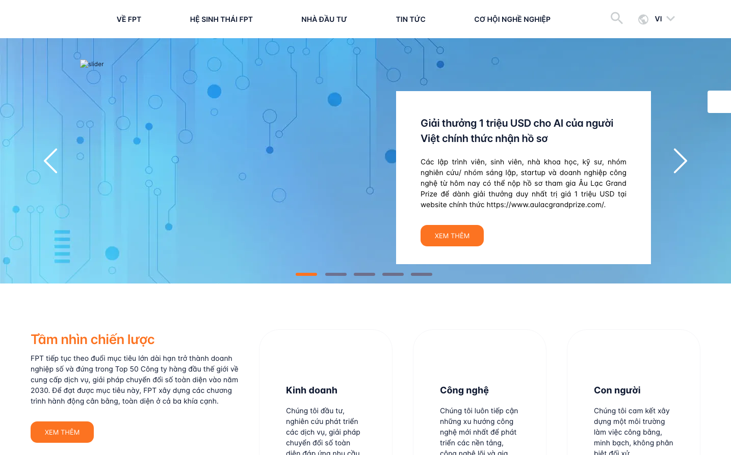
- AI and technology messaging prominently featured in hero sections
Target Audience
Korean digital natives and professionals who rely on comprehensive information platforms for both personal and business decision-making, spanning search, news, finance, and AI services
Mood
Design descriptions are AI-generated based on visual analysis and may not fully reflect the brand's official design guidelines.
Design System
Typography Scale
| Element | Font | Size | Weight | Line Height |
|---|---|---|---|---|
| body | 16px | 400 | normal | |
| h1 | 32px | 700 | normal | |
| h3 | 18.72px | 700 | normal | |
| h5 | 26px | 600 | 35.984px | |
| p | 32px | 600 | 46.9984px | |
| a | 16px | 400 | normal | |
| button | 16px | 400 | normal | |
| input | 48px | 600 | 60px | |
| nav | 16px | 400 | normal | |
| header | 16px | 400 | normal |
Color Palette
#007aff#ffffff#1d1d1f#f6f7fb#6e6e73#d5d7da#f2f4f5#717680#ff5f00#f7f9fa#2e2e2e#a4a7ae