Help us build this. Leave comments, suggest improvements, and help create better design documentation for agents.
Neiman Marcus
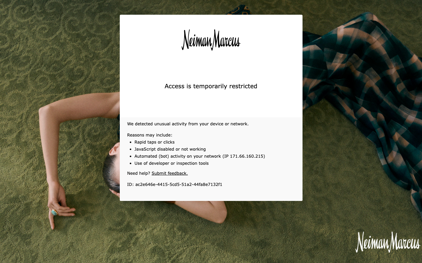
RetailNeiman Marcus embodies luxury department store sophistication through classic serif typography and pristine white space, creating an atmosphere of exclusive retail refinement. The design speaks to discerning shoppers who expect both digital elegance and the tactile luxury of high-end fashion retail.
Design Identity
Signature Color
Neiman Black
#000000
timeless luxury authority and exclusive retail sophistication
Visual Identity
The distinctive script logotype paired with generous white space and classical serif body text creates an unmistakable luxury retail aesthetic that feels more like a private boutique than a digital storefront.
Component Style
Clean, borderless components with minimal visual weight - the error message card uses soft edges and relies on typography hierarchy rather than heavy styling elements. Everything feels understated and refined.
Spacing Philosophy
Expansive white space dominates the composition, with the message card floating in a sea of negative space. This creates a sense of luxury and exclusivity, making each element feel precious and considered.
Design Principles
- Typography carries all visual weight - no decorative elements
- White space is the primary design tool
- Script branding paired with classical serif body text
- Minimal color palette focused on black and white
- Error states maintain the same luxurious restraint
Target Audience
affluent shoppers aged 35-65 who value heritage luxury brands and expect sophisticated digital experiences that mirror high-end retail environments
Mood
Design descriptions are AI-generated based on visual analysis and may not fully reflect the brand's official design guidelines.
Design System
Typography Scale
| Element | Font | Size | Weight | Line Height |
|---|---|---|---|---|
| body | 16px | 400 | normal |
Color Palette
No colors extracted
UI Elements
No components detected