Help us build this. Leave comments, suggest improvements, and help create better design documentation for agents.
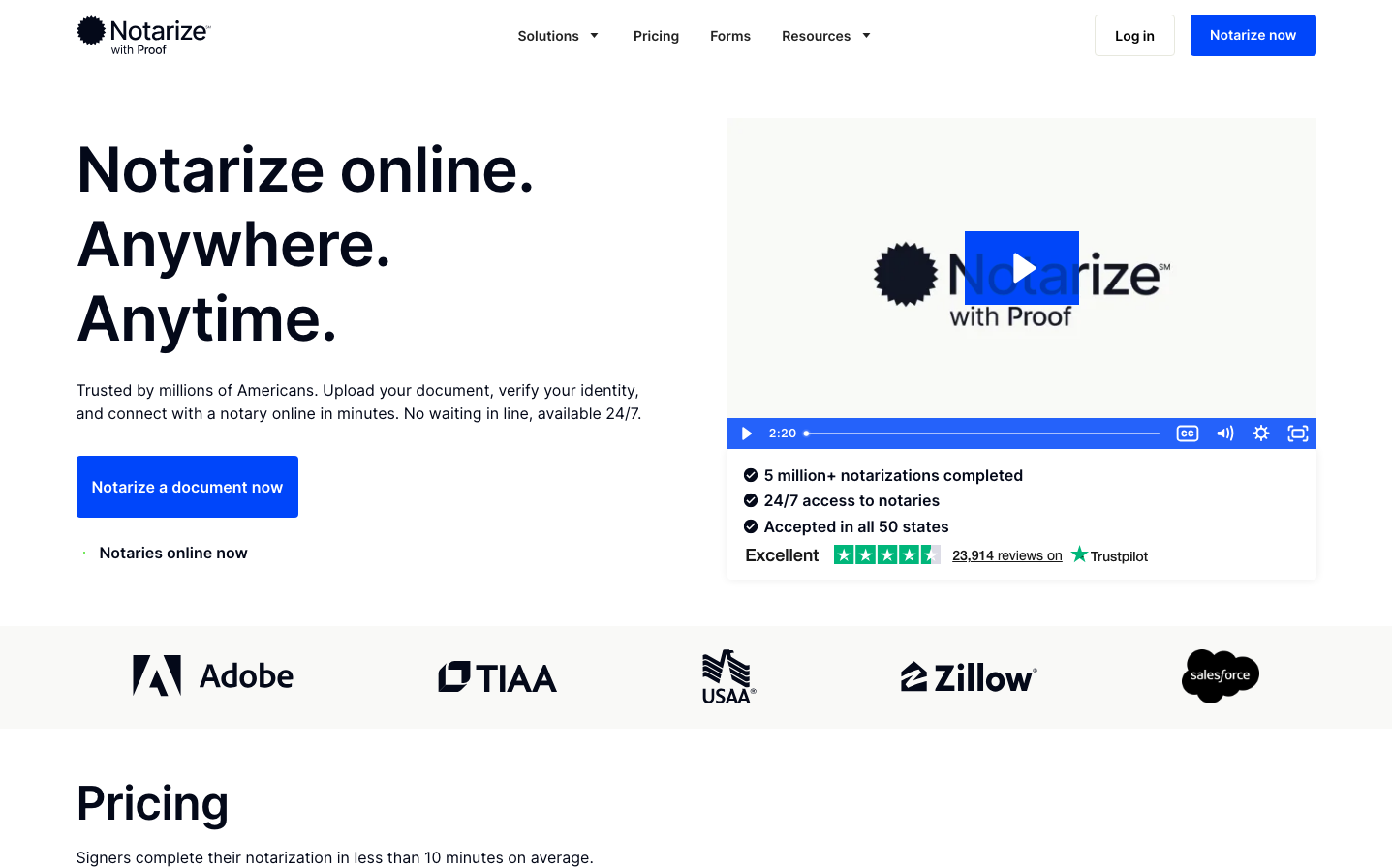
Notarize
Legal TechNotarize projects institutional trust through a sophisticated high-contrast aesthetic anchored by bold electric blue elements against clean whites and deep blacks. The typography hierarchy uses Inter's measured proportions to convey professional authority, while the dramatic blue creates urgency and digital confidence in what could otherwise feel like dry legal service.
Design Identity
Signature Color
Notarize Electric Blue
#1E5AFF
Digital trust and legal authority - bridges traditional notary gravitas with modern tech accessibility
Visual Identity
Dramatic high-contrast composition with massive bold headlines in stark black paired with vivid electric blue accent elements that create visual tension and digital energy
Component Style
Clean rectangular buttons with moderate 8px border radius, solid fills with no shadows or borders. Components feel substantial and trustworthy rather than playful - built for serious transactions with confident color contrast.
Spacing Philosophy
Generous vertical breathing room with large gaps between major sections, but efficient horizontal use of space. The layout prioritizes readability hierarchy over dense information packing.
Design Principles
- Headlines never go below 48px to maintain authority
- Electric blue reserved for primary actions and key trust indicators
- Border radius consistently 8px or less for professional feel
- High contrast ratios throughout - no subtle grays
- Video content integrated as trust-building proof points
Target Audience
Busy professionals and individuals who need notarization but value convenience over traditional in-person formality - people who want legal validity without legal complexity
Mood
Design descriptions are AI-generated based on visual analysis and may not fully reflect the brand's official design guidelines.
Design System
Typography Scale
| Element | Font | Size | Weight | Line Height |
|---|---|---|---|---|
| body | 16px | 400 | 24px | |
| h1 | 64px | 600 | 76.8px | |
| h2 | 48px | 600 | 57.6px | |
| h3 | 20px | 600 | 28px | |
| p | 16px | 400 | 24px | |
| a | 16px | 400 | 24px | |
| nav | 16px | 400 | 24px | |
| header | 16px | 400 | 24px | |
| footer | 16px | 400 | 24px | |
| main | 16px | 400 | 24px |
Color Palette
No colors extracted