Help us build this. Leave comments, suggest improvements, and help create better design documentation for agents.
Novartis
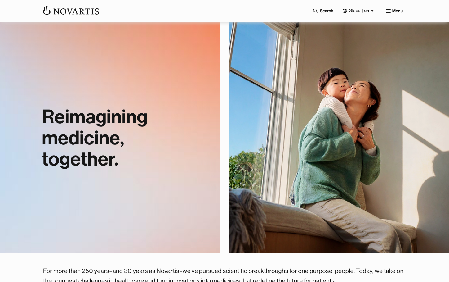
HealthcareNovartis projects pharmaceutical sophistication through a warm, optimistic gradient palette that transitions from coral-pink to sky blue, paired with the distinctive Volta Modern Display typeface that feels both clinical and human. The composition balances aspirational messaging with intimate imagery, creating trust through accessibility rather than corporate distance.
Design Identity
Signature Color
Therapeutic Coral
#FF8A80
healing warmth that bridges scientific precision with human care
Visual Identity
The signature warm-to-cool gradient background that flows from coral-pink to blue, paired with generous asymmetrical layouts that give equal weight to typography and human-centered photography.
Component Style
Clean, minimal elements with subtle shadows and generous padding. Buttons and components feel approachable rather than clinical, with soft corners and breathing room that prioritizes accessibility over sharpness.
Spacing Philosophy
Expansive vertical rhythm with large section breaks and asymmetrical grid layouts. The 50/50 split between text and imagery creates balance, while generous margins around key messaging elements emphasize readability and calm.
Design Principles
- Typography hierarchy uses only Volta Modern Display variants with 62px for hero headlines
- Body text maintains 16px/24px for optimal readability
- Gradient backgrounds flow from warm coral (#FF8A80) to cool blue (#64B5F6)
- 50/50 split-screen layouts balance text and human imagery
- Minimal UI chrome keeps focus on content and messaging
Target Audience
Healthcare professionals and patients who value both scientific rigor and human connection - people seeking trustworthy medical innovation that feels approachable rather than intimidating.
Mood
Design descriptions are AI-generated based on visual analysis and may not fully reflect the brand's official design guidelines.
Design System
Typography Scale
| Element | Font | Size | Weight | Line Height |
|---|---|---|---|---|
| body | 16px | 400 | 24px | |
| h1 | 62px | 600 | 68px | |
| h2 | 32px | 500 | 36px | |
| h3 | 22px | 500 | 26px | |
| p | 16px | 400 | 24px | |
| a | 15.04px | 400 | 25.568px | |
| button | 14px | 400 | 20.02px | |
| input | 16px | 400 | 24px | |
| nav | 16px | 400 | 24px | |
| header | 16px | 400 | 24px |
Color Palette
#ffffff#dddddd#fafafa#333333#9e9e9e#2196f3#f44336#bbdefb#909090#ffeb3b#212529#dee2e6