Help us build this. Leave comments, suggest improvements, and help create better design documentation for agents.
Opay
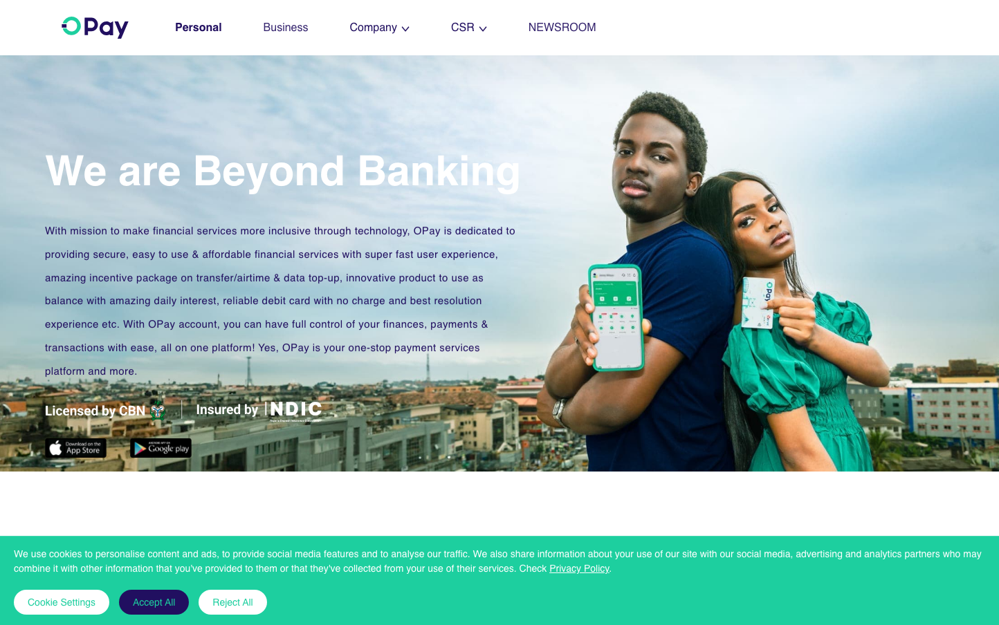
FintechOPay's brand aesthetic centers on aspirational African financial empowerment, using a distinctive mint-turquoise palette that feels both trustworthy and optimistic. The heavy Graphik typography creates confident, bold statements while the diverse human imagery positions the brand as authentically inclusive and community-focused.
Design Identity
Signature Color
OPay Mint
#00D4AA
Fresh financial opportunity - trustworthy like traditional banking green but energetic like modern fintech
Visual Identity
The combination of mint-turquoise brand color with authentic African lifestyle photography and bold white typography overlays - creating an aspirational yet accessible fintech aesthetic.
Component Style
Clean, minimal components with subtle rounded corners and flat design - no heavy shadows or borders. The debit card has gentle curves while the phone interface maintains crisp, geometric lines. Everything feels approachable rather than intimidating.
Spacing Philosophy
Generous breathing room around hero content with asymmetrical layout - text occupies roughly 40% of screen width while lifestyle imagery takes prominence. Creates an editorial, magazine-like hierarchy.
Design Principles
- Typography uses extreme weight contrast - 700 weight headlines against 400 weight body text
- Hero sections always pair bold text overlays with authentic lifestyle photography
- Mint green appears strategically in small doses - cards, accent elements, never overwhelming
- Content follows 60/40 split - imagery dominant, text supporting
- White text on image overlays ensures readability while maintaining visual impact
Target Audience
Young African professionals and entrepreneurs seeking modern banking alternatives who value both financial inclusion and aspirational lifestyle imagery
Mood
Design descriptions are AI-generated based on visual analysis and may not fully reflect the brand's official design guidelines.
Design System
Typography Scale
| Element | Font | Size | Weight | Line Height |
|---|---|---|---|---|
| body | 16px | 400 | normal | |
| h1 | 60.2148px | 700 | 72.2578px | |
| h2 | 44.764px | 600 | 60.2148px | |
| h3 | 13.718px | 700 | 15.0176px | |
| p | 15.0176px | 400 | 96.3148px | |
| a | 16px | 400 | normal | |
| nav | 16px | 400 | normal |
Color Palette
#007aff