Help us build this. Leave comments, suggest improvements, and help create better design documentation for agents.
Paddle
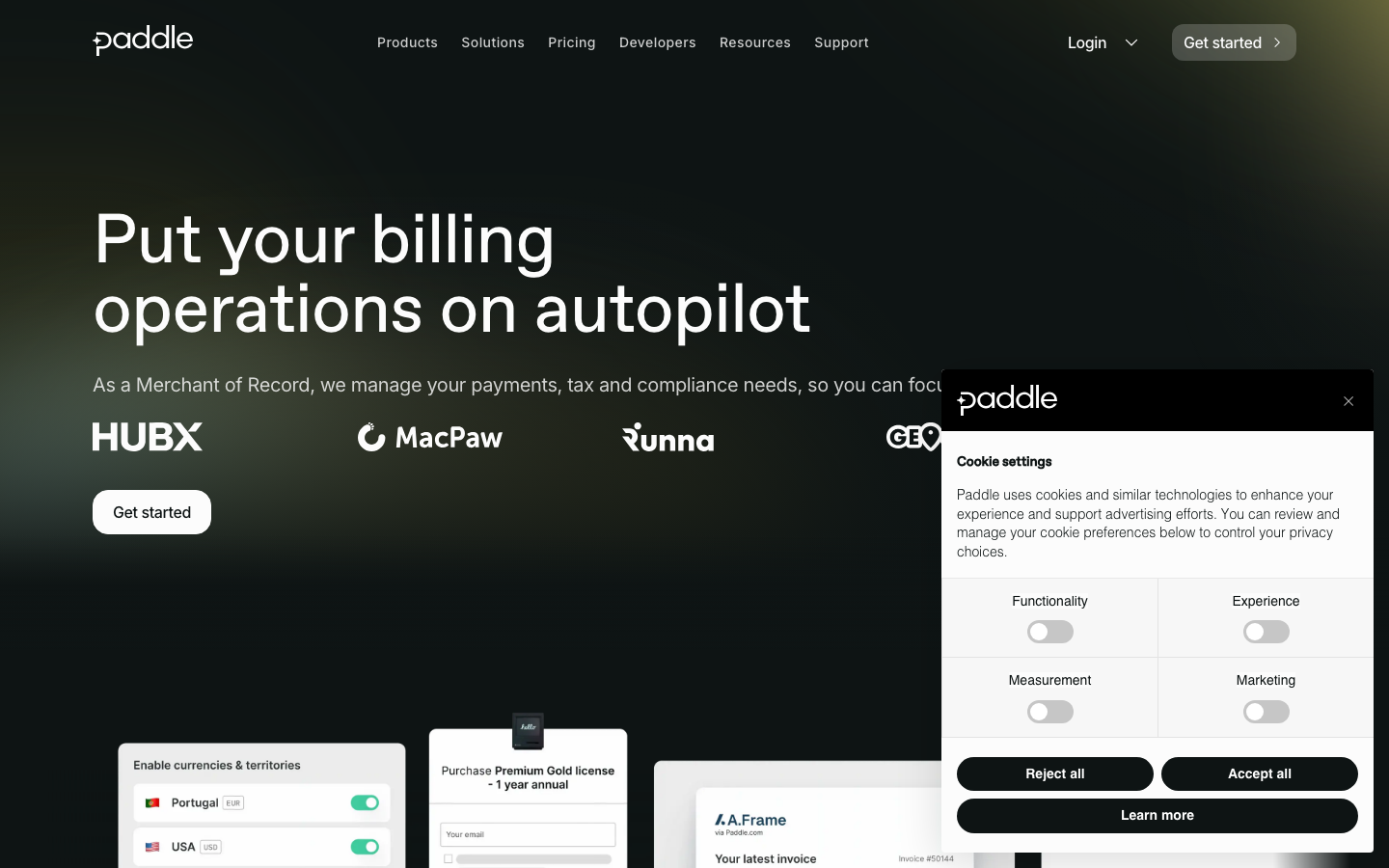
FintechPaddle's brand exudes nocturnal sophistication with its deep charcoal foundation (#0e1414) and strategic electric yellow accents (#fff800), creating a premium fintech atmosphere. The generous typography scaling from abcFavorit creates editorial elegance, while the dark palette suggests expertise in complex financial operations that happen behind the scenes.
Design Identity
Signature Color
Electric Yellow
#fff800
Financial clarity and premium automation - cuts through complexity like a spotlight
Visual Identity
The dramatic dark background with surgical yellow highlights and massive typographic hierarchy - it feels like a premium financial control room where serious business happens.
Component Style
Rounded corners with generous padding, subtle cards floating on dark backgrounds. Buttons have substantial padding and medium border radius (likely 8-12px), creating approachable sophistication rather than sharp corporate edges.
Spacing Philosophy
Luxurious vertical rhythm with massive headline spacing and generous section padding. The layout breathes with premium confidence - wide margins and substantial component gaps suggest this isn't competing on screen real estate.
Design Principles
- Headlines use 72px abcFavorit with tight line-height for editorial impact
- Body text scales to 20px for premium readability
- Dark background (#0e1414) anchors all compositions
- Yellow (#fff800) used sparingly for critical actions and highlights
- Card backgrounds (#181c1d) create subtle layering on dark foundation
Target Audience
SaaS founders and finance directors who need enterprise-grade billing automation but want it to feel premium rather than bureaucratic
Mood
Design descriptions are AI-generated based on visual analysis and may not fully reflect the brand's official design guidelines.
Design System
Typography Scale
| Element | Font | Size | Weight | Line Height |
|---|---|---|---|---|
| body | 20px | 400 | 30px | |
| h1 | 72px | 400 | 72px | |
| h2 | 48px | 400 | 57.6px | |
| h3 | 40px | 400 | 48px | |
| h4 | 24px | 400 | 28.8px | |
| h5 | 20px | 500 | 24px | |
| h6 | 16px | 500 | 19.2px | |
| p | 14px | 400 | 21px | |
| a | 20px | 400 | 30px | |
| button | 20px | 400 | 30px |
Color Palette
#fcfcfc#696d6d#0e1414#181c1d#fff800#fddad5#fcc7bf#faa396#f77f6c#f55a42#f4472c#db4028