Help us build this. Leave comments, suggest improvements, and help create better design documentation for agents.
Panasonic
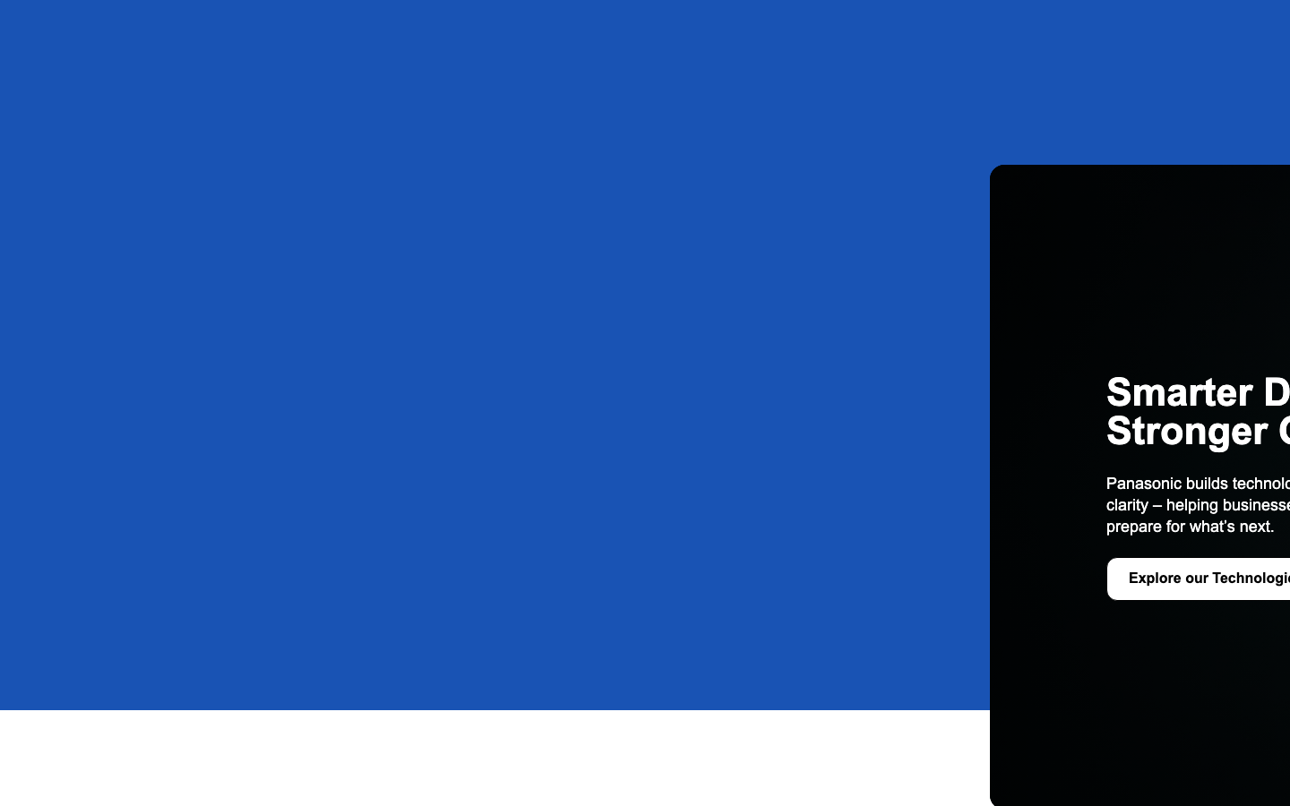
Consumer ElectronicsPanasonic's brand aesthetic combines bold corporate confidence with futuristic optimism, anchored by an authoritative royal blue that commands attention across the entire visual field. The typography hierarchy using Proxima Nova creates a sophisticated technical narrative that balances approachability with enterprise credibility.
Design Identity
Signature Color
Panasonic Royal Blue
#1E4A9C
Corporate authority and technological innovation - a deep blue that signals trust, reliability, and cutting-edge advancement
Visual Identity
Immersive color blocking with a dominant blue field that creates environmental presence rather than just accent color - the brand becomes the backdrop, not just an element within it.
Component Style
Clean geometric components with moderate corner rounding (likely 6-8px), emphasizing substance over decoration. White buttons against deep blue create high contrast focal points with generous padding that feels substantial and clickable.
Spacing Philosophy
Generous macro spacing creates breathing room for the intense blue saturation, while tight component spacing maintains focus. The layout uses negative space strategically to prevent color overwhelming.
Design Principles
- Blue dominance - primary color occupies 70%+ of visual space
- High contrast white-on-blue for all primary actions
- Typography weights jump dramatically: 400 for body, 700 for headers
- Moderate border radius between 6-12px for approachable professionalism
- White space serves as visual relief from color intensity
Target Audience
Enterprise technology decision-makers and B2B buyers who need to trust billion-dollar infrastructure investments
Mood
Design descriptions are AI-generated based on visual analysis and may not fully reflect the brand's official design guidelines.
Design System
Typography Scale
| Element | Font | Size | Weight | Line Height |
|---|---|---|---|---|
| body | 16px | 400 | 22.4px | |
| h1 | 43.2px | 700 | 43.2px | |
| h2 | 40px | 700 | 43.2px | |
| h3 | 24px | 700 | 38px | |
| p | 18px | 400 | 24px | |
| a | 16px | 400 | 22.4px | |
| button | 16px | 600 | 18.4px | |
| input | 16px | 400 | 18.4px | |
| nav | 16px | 400 | 22.4px | |
| header | 16px | 400 | 22.4px |
Color Palette
No colors extracted