Help us build this. Leave comments, suggest improvements, and help create better design documentation for agents.
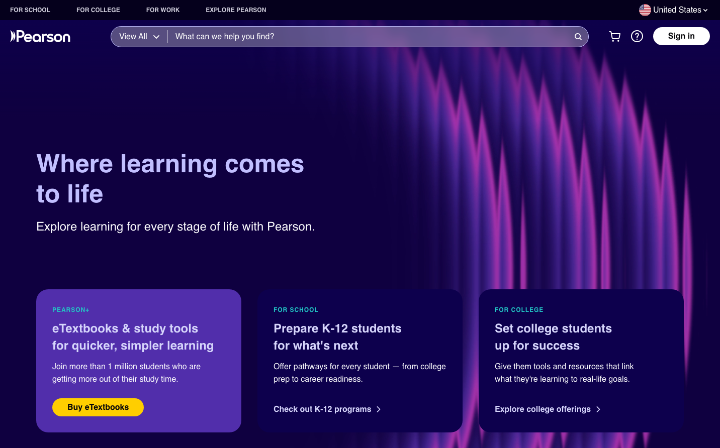
Pearson
EdTechPearson creates a nocturnal learning environment with deep purple-to-pink gradients that evoke late-night study sessions and the electric moment of understanding. The Plus Jakarta Sans typography strikes a balance between academic authority and approachable warmth, while the aurora-like background suggests knowledge illumination.
Design Identity
Signature Color
Academic Gold
#ffce00
Achievement and breakthrough moments in learning - the lightbulb moment when concepts click
Visual Identity
The dramatic vertical light rays transitioning from deep purple to electric pink create an unmistakable aurora effect that suggests knowledge illuminating the darkness of ignorance.
Component Style
Cards have subtle rounded corners with generous padding, floating against the cosmic background without harsh borders. The yellow CTA button creates a solar accent against the nocturnal palette - warm, inviting, and impossible to miss.
Spacing Philosophy
Generous vertical breathing room between content sections mirrors the expansive cosmic background, while card interiors maintain intimate 24px padding to keep learning content digestible and focused.
Design Principles
- Yellow CTAs always contrast against purple backgrounds for maximum visibility
- Typography uses Plus Jakarta Sans exclusively with weights 400-700
- Gradient backgrounds transition vertically from dark purple (#1a0d2e) to electric pink
- Card corners never exceed 12px radius to maintain subtle sophistication
- White text on dark backgrounds ensures nocturnal readability
Target Audience
Lifelong learners and educators who see learning as a transformative journey, from K-12 teachers planning lessons at night to college students cramming before dawn
Mood
Design descriptions are AI-generated based on visual analysis and may not fully reflect the brand's official design guidelines.
Design System
Typography Scale
| Element | Font | Size | Weight | Line Height |
|---|---|---|---|---|
| body | 16px | 400 | normal | |
| h1 | 50px | 700 | 60px | |
| h2 | 24px | 400 | 28.8px | |
| h3 | 30px | 500 | 36px | |
| h4 | 24px | 500 | 33.6px | |
| h5 | 22px | 500 | 30.8px | |
| h6 | 18px | 600 | 28.8px | |
| p | 16px | 400 | 25.6px | |
| a | 16px | 600 | normal | |
| button | 16px | 400 | normal |
Color Palette
#7b1571#ec8de2#b820a9#df41cf#7f6701#ffe266#bf9a00#ffce00#168584#9aeeed#22c7c6#56e2e1