Help us build this. Leave comments, suggest improvements, and help create better design documentation for agents.
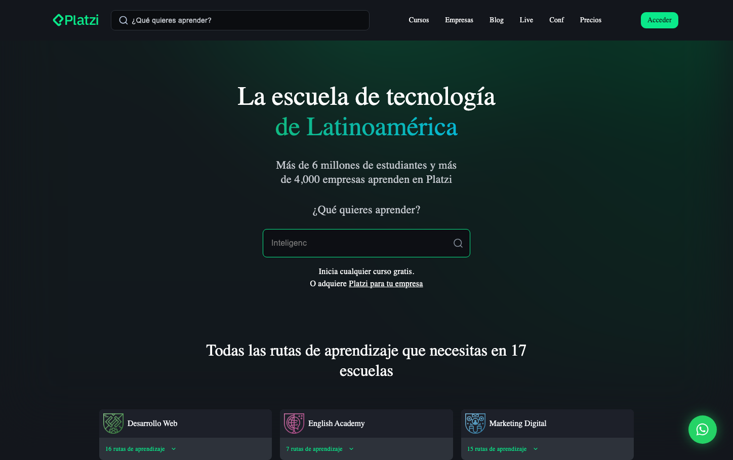
Platzi
EdTechPlatzi embodies a sophisticated nocturnal learning atmosphere with its electric green accent cutting through deep charcoal gradients. The typography hierarchy using Roobert creates an editorial elegance that feels more like a premium publication than a typical ed-tech platform.
Design Identity
Signature Color
Platzi Electric Green
#98CA3F
Growth-focused innovation that cuts through complexity - representing the spark of learning and Latin American tech ambition
Visual Identity
The dramatic dark gradient background with strategically placed electric green highlights creates an unmistakable 'learning in the future' aesthetic that feels more like a cutting-edge startup than traditional education.
Component Style
Minimalist components with subtle rounded corners (approximately 6-8px), no heavy shadows, and clean 1-2px borders. The primary CTA uses the signature green with generous padding, while interactive elements maintain elegant restraint.
Spacing Philosophy
Generous vertical breathing room with 80-120px section gaps creates a premium, unhurried learning experience. Text blocks use tight 16-24px internal spacing to maintain readability hierarchy.
Design Principles
- Dark backgrounds with strategic green accent placement
- Typography scales from 16px body to 52px headlines with consistent Roobert family
- Border radius stays between 6-12px for modern but not playful feel
- White text maintains high contrast against dark gradients
- Green is used sparingly as the primary action color
Target Audience
Ambitious Latin American tech professionals and students who see learning as a premium, transformative experience rather than casual skill-building
Mood
Design descriptions are AI-generated based on visual analysis and may not fully reflect the brand's official design guidelines.
Design System
Typography Scale
| Element | Font | Size | Weight | Line Height |
|---|---|---|---|---|
| body | 16px | 400 | normal | |
| h1 | 52px | 400 | 60px | |
| h2 | 32px | 500 | 40px | |
| h3 | 16px | 500 | 22px | |
| h6 | 16px | 400 | 24px | |
| p | 22px | 400 | 28px | |
| a | 16px | 400 | normal | |
| button | 13.3333px | 400 | 0px | |
| input | 14px | 400 | 22px | |
| nav | 16px | 400 | normal |
Color Palette
No colors extracted