Help us build this. Leave comments, suggest improvements, and help create better design documentation for agents.
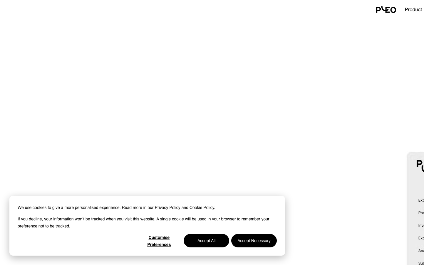
Pleo
FintechPleo employs a sophisticated dual-typography system with Neue Haas Grotesk Display for headings creating authoritative presence, while Lato handles body text for approachable readability. The muted rose accent (#b2535f) evokes trustworthy financial sophistication without the typical fintech blue, suggesting a more human approach to business expense management.
Design Identity
Signature Color
Pleo Rose
#b2535f
Humanized fintech trust - warmer than traditional banking blues, suggesting approachable financial expertise
Visual Identity
The distinctive pairing of premium Neue Haas Grotesk Display headlines with softer Lato body text creates an unmistakable hierarchy that balances corporate authority with human accessibility.
Component Style
Clean, minimal components with subtle depth shadows (8px blur, -4px spread). Buttons likely use gentle rounded corners with the signature rose accent, avoiding harsh borders in favor of soft elevation effects.
Spacing Philosophy
Generous vertical rhythm with substantial gaps between content sections, allowing the dual typography system to breathe while maintaining intimate 14px body text for detailed financial information.
Design Principles
- Headlines always use Neue Haas Grotesk Display at 400 weight for consistent authority
- Body content exclusively uses Lato at 14px for optimal financial data readability
- Interactive elements use the signature rose (#b2535f) sparingly for maximum impact
- Shadows provide depth with 8px blur and negative spread for floating effects
- Line heights maintain 1.5x ratio for body text, tighter for headlines
Target Audience
Finance teams and business managers who appreciate design sophistication but need practical expense management tools that feel approachable rather than intimidatingly corporate
Mood
Design descriptions are AI-generated based on visual analysis and may not fully reflect the brand's official design guidelines.
Design System
Typography Scale
| Element | Font | Size | Weight | Line Height |
|---|---|---|---|---|
| body | 16px | 400 | 24px | |
| h1 | 64px | 400 | 70.4px | |
| h2 | 45px | 400 | 54px | |
| h3 | 23px | 400 | 36.8px | |
| p | 14px | 400 | 24.5px | |
| a | 14px | 400 | 24.5px | |
| button | 14px | 400 | 24.5px | |
| nav | 16px | 400 | 24px | |
| header | 16px | 400 | 24px | |
| footer | 16px | 400 | 24px |
Color Palette
#222222#000000#737373#b2535f#7b3840#b3b3b3#ffffff#d61f1f#a51d1d#2c8354#255937#286ecc