Help us build this. Leave comments, suggest improvements, and help create better design documentation for agents.
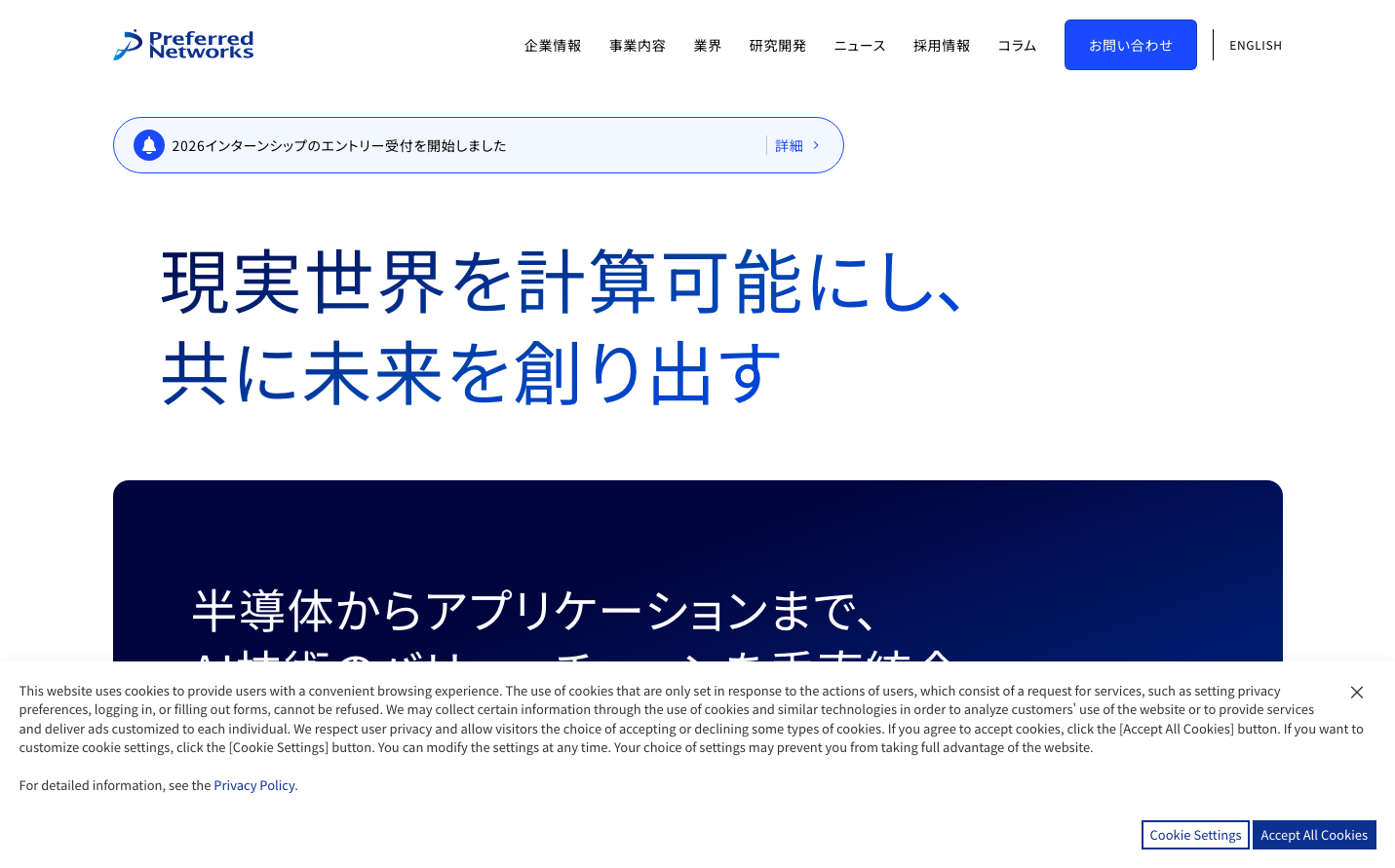
Preferred Networks
AIPreferred Networks embodies a sophisticated AI research aesthetic with deep navy backgrounds contrasting against bright blue accents, creating a nocturnal laboratory atmosphere. The Japanese typography (Noto Sans JP) paired with bold blue geometric elements suggests precision-focused innovation that bridges Eastern craftsmanship with cutting-edge computation.
Design Identity
Signature Color
Research Blue
#228be6
computational intelligence and algorithmic precision
Visual Identity
Deep navy hero sections with bright blue geometric accent shapes and Japanese typography create an unmistakable research laboratory aesthetic that feels both academic and futuristic.
Component Style
Soft rounded corners with subtle shadows, bright blue primary buttons with generous padding, and clean notification cards with light blue backgrounds - everything feels approachable yet technical.
Spacing Philosophy
Generous whitespace creates breathing room around content sections, while compact internal padding keeps UI elements efficient - balancing research depth with interface clarity.
Design Principles
- Primary blue (#228be6) dominates interactive elements
- Dark navy backgrounds (#1a1b3e) for hero sections
- Noto Sans JP typography maintains Japanese identity
- Subtle shadows (xs/sm) provide gentle depth
- White backgrounds with blue accents for content areas
Target Audience
AI researchers, machine learning engineers, and Japanese tech professionals who value scientific rigor and computational excellence
Mood
Design descriptions are AI-generated based on visual analysis and may not fully reflect the brand's official design guidelines.
Design System
Typography Scale
| Element | Font | Size | Weight | Line Height |
|---|---|---|---|---|
| body | 16px | 400 | 25.6px | |
| h1 | 16px | 400 | 25.6px | |
| h2 | 30px | 400 | 45px | |
| h3 | 22px | 400 | 33px | |
| p | 14px | 400 | 18.2px | |
| a | 16px | 400 | 25.6px | |
| button | 16px | 400 | 25.6px | |
| nav | 16px | 400 | 25.6px | |
| header | 16px | 400 | 25.6px | |
| footer | 16px | 400 | 25.6px |
Color Palette
#ffffff#000000#e7f5ff#d0ebff#a5d8ff#74c0fc#4dabf7#339af0#228be6#1c7ed6#1971c2#1864ab