Help us build this. Leave comments, suggest improvements, and help create better design documentation for agents.
Roam
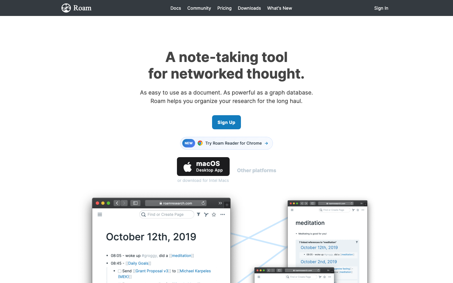
ProductivityRoam embodies intellectual rigor through stark, utilitarian design that prioritizes substance over aesthetics. The subdued steel blue palette and generous whitespace create a contemplative, academic atmosphere that feels like a digital library for serious thinkers.
Design Identity
Signature Color
Research Blue
#137cbd
academic authority and deep thinking - the color of scholarly focus and intellectual trust
Visual Identity
Extreme whitespace abundance with minimal visual hierarchy - the interface breathes like a high-end academic journal, where content density is deliberately low to encourage contemplation.
Component Style
Minimal rounded corners (4-6px) with clean borders and subtle shadows. Components feel lightweight and unobtrusive - buttons have gentle curves but maintain professional restraint, never competing with content for attention.
Spacing Philosophy
Luxurious vertical spacing with 80px+ gaps between major sections creates a sense of intellectual breathing room. Horizontal centering and constrained content width (max 800px) forces focus on individual ideas.
Design Principles
- Content width never exceeds 60% of viewport to maintain reading focus
- Vertical spacing between sections uses 80px minimum gaps
- Border radius stays between 4-8px for subtle softness
- Typography uses only 3 weights: 400, 500, 600
- Primary blue (#137cbd) is the only saturated color allowed
Target Audience
Researchers, academics, and knowledge workers who value deep thinking over quick consumption - people who spend hours connecting ideas rather than skimming content.
Mood
Design descriptions are AI-generated based on visual analysis and may not fully reflect the brand's official design guidelines.
Design System
Typography Scale
| Element | Font | Size | Weight | Line Height |
|---|---|---|---|---|
| body | 14px | 400 | 20px | |
| h1 | 36px | 500 | 39.6px | |
| h3 | 24px | 500 | 26.4px | |
| h4 | 18px | 500 | 19.8px | |
| p | 16px | 500 | 21px | |
| a | 14px | 400 | 21px | |
| button | 14px | 400 | 21px | |
| input | 14px | 400 | 20px | |
| nav | 14px | 400 | 21px | |
| header | 14px | 400 | 21px |
Color Palette
#137cbd#e1e8ed#202b33#30404d#293742#354655#252a31#a7b6c2#0060df#f0f0f4#8f8f9d#3b82f6