Help us build this. Leave comments, suggest improvements, and help create better design documentation for agents.
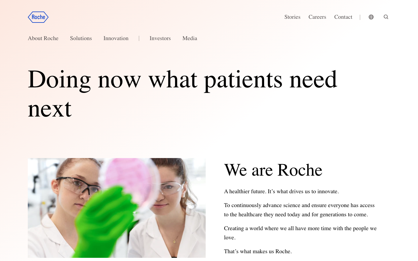
Roche
HealthcareRoche's aesthetic communicates pharmaceutical precision through ethereal lightness - ultra-thin typography on pearl-toned backgrounds creates an almost weightless, scientific elegance. The blush-pink foundation paired with whisper-thin letterforms evokes trust through transparency rather than corporate heaviness.
Design Identity
Signature Color
Roche Blue
#0b41cd
scientific authority and healthcare innovation trust
Visual Identity
The signature 200-weight typography creates an instantly recognizable gossamer-thin aesthetic - text so light it appears to float, paired with generous breathing room and pearl-tinted backgrounds.
Component Style
Components feel weightless and refined - buttons likely use subtle borders or minimal fills rather than heavy shadows. The 200-weight typography suggests UI elements prioritize elegance over bold visual presence, with clean edges and restrained treatments.
Spacing Philosophy
Extremely generous vertical spacing creates a sense of scientific precision and luxury - large gaps between content blocks allow each element to breathe independently, mimicking the careful spacing found in medical documentation.
Design Principles
- Typography never exceeds 200 weight for primary content, creating consistent lightness
- Body text maintains 20px size with generous 32px line height for readability
- Headings use dramatic size jumps: 88px for H1, 48px for H2, creating clear hierarchy
- Blue accent color (#0b41cd) reserved for key interactive elements and branding
- Backgrounds favor subtle warm tints over pure white
Target Audience
Healthcare professionals, medical researchers, and pharmaceutical industry stakeholders who value scientific credibility over flashy marketing
Mood
Design descriptions are AI-generated based on visual analysis and may not fully reflect the brand's official design guidelines.
Design System
Typography Scale
| Element | Font | Size | Weight | Line Height |
|---|---|---|---|---|
| body | 20px | 200 | 32px | |
| h1 | 88px | 200 | 101px | |
| h2 | 48px | 200 | 58px | |
| h3 | 23.4px | 200 | 32px | |
| p | 20px | 400 | 30px | |
| a | 20px | 400 | 30px | |
| button | 20px | 400 | 23px | |
| nav | 20px | 200 | 32px | |
| header | 20px | 200 | 32px | |
| footer | 20px | 200 | 32px |
Color Palette
#007aff#022366#072b89#0936ab#0b41cd#3461d5#5c80de#85a0e6#aec0ee#d7e0f7#f1f9fe#1482fa