Help us build this. Leave comments, suggest improvements, and help create better design documentation for agents.
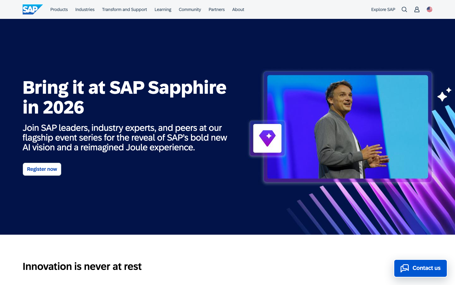
SAP
EnterpriseSAP's brand exudes enterprise authority through a commanding midnight navy foundation punctuated by electric violet and cyan gradients. The massive, bold typography creates executive gravitas while the geometric layouts signal systematic precision that enterprise leaders expect from mission-critical software.
Design Identity
Signature Color
SAP Enterprise Blue
#0057d2
corporate reliability and enterprise-grade trustworthiness
Visual Identity
Dramatic dark navy backgrounds with large-scale typography and geometric gradient overlays in purple/cyan that create a premium enterprise software aesthetic - instantly recognizable by the bold contrast and systematic layout patterns.
Component Style
Rounded corners at 6-8px with solid fills, no heavy shadows - components feel substantial yet approachable. The primary button uses moderate rounding with solid blue background, maintaining enterprise credibility without being overly conservative.
Spacing Philosophy
Generous whitespace around hero content creates executive presence, while systematic 8-16px increments maintain enterprise order. The layout breathes with purpose rather than cramming information.
Design Principles
- Border radius constrained to 2-16px range for systematic consistency
- Typography limited to 72 Brand Variable with distinct weight hierarchy (400, 500, 700)
- Hero text always uses 57px at 700 weight for maximum executive impact
- Dark navy (#1a2733) backgrounds establish enterprise authority
- Gradient overlays limited to purple/cyan spectrum for premium feel
Target Audience
C-suite executives and enterprise IT decision-makers who need to justify million-dollar software investments to boards
Mood
Design descriptions are AI-generated based on visual analysis and may not fully reflect the brand's official design guidelines.
Design System
Typography Scale
| Element | Font | Size | Weight | Line Height |
|---|---|---|---|---|
| body | 15px | 400 | 21px | |
| h1 | 57px | 700 | 62.7px | |
| h2 | 32px | 500 | 35.2px | |
| h3 | 20px | 500 | 22px | |
| h5 | 16px | 400 | normal | |
| h6 | 16px | 500 | 17.6px | |
| p | 16px | 400 | normal | |
| a | 15px | 400 | 21px | |
| button | 13.3333px | 400 | normal | |
| nav | 15px | 400 | 21px |
Color Palette
#d1efff#1a2733#d5dadd#ffffff#a00875#7858ff#d20a0a#5b738b#002a86#188918#f31ded#07838f