Help us build this. Leave comments, suggest improvements, and help create better design documentation for agents.
Sharp
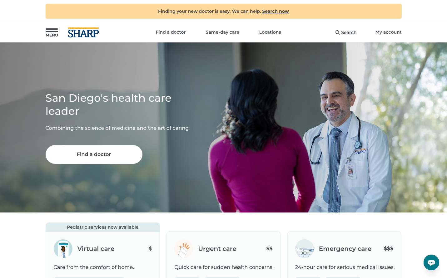
Consumer ElectronicsSharp Healthcare employs a distinctive healthcare aesthetic that balances professional medical authority with warm human connection. The Montserrat typography creates a friendly yet credible voice, while the clean white interface with strategic use of Sharp blue conveys medical precision without clinical coldness.
Design Identity
Signature Color
Sharp Medical Blue
#007aff
Trustworthy healthcare innovation - combining medical authority with accessible care
Visual Identity
Generous whitespace with subtle overlays and soft-edged photography creates a distinctly approachable medical environment - less sterile clinic, more welcoming health partner
Component Style
Soft, rounded buttons with generous padding feel approachable and finger-friendly. Cards have minimal shadows and clean edges, maintaining medical precision while avoiding harsh clinical aesthetics.
Spacing Philosophy
Expansive breathing room with large hero sections and comfortable component spacing creates a calming, unhurried healthcare experience - the opposite of cramped medical forms
Design Principles
- Montserrat at 500 weight creates friendly medical authority
- Button text uses 14px at 600 weight for clear medical CTAs
- Generous button padding (estimated 16px 32px) for accessibility
- Soft corner radius around 8-12px avoids harsh medical angles
- White backgrounds dominate with strategic blue accent placement
Target Audience
San Diego families and individuals seeking personalized healthcare who value both medical expertise and human connection over impersonal institutional care
Mood
Design descriptions are AI-generated based on visual analysis and may not fully reflect the brand's official design guidelines.
Design System
Typography Scale
| Element | Font | Size | Weight | Line Height |
|---|---|---|---|---|
| body | 16px | 500 | 28px | |
| h1 | 34px | 500 | 42px | |
| h2 | 28px | 500 | 36px | |
| h3 | 14px | 600 | 24px | |
| h5 | 16px | 600 | 28px | |
| p | 14px | 600 | 24px | |
| a | 14px | 700 | 24px | |
| button | 14px | 600 | 17.5px | |
| input | 16px | 500 | 28px | |
| nav | 16px | 500 | 28px |
Color Palette
#007aff#ffffff