Help us build this. Leave comments, suggest improvements, and help create better design documentation for agents.
Smartly
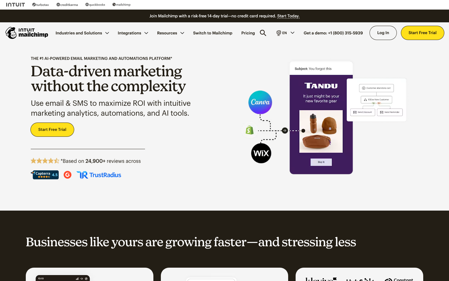
MarketingSmartly's aesthetic centers on sophisticated minimalism through a commanding violet-purple signature that radiates creative intelligence. The brand balances sharp precision with ethereal gradients, creating an atmosphere of advanced AI capability wrapped in approachable elegance.

Design Identity
Signature Color
Smartly Violet
#7a30d8
AI-powered creativity and premium automation intelligence
Visual Identity
The distinctive halftone dot gradient pattern that transitions from dense to sparse, creating dimensional depth while maintaining minimal sophistication - a visual metaphor for AI processing and data transformation.
Component Style
Ultra-minimal components with whisper-thin borders and generous breathing room. Elements feel weightless yet precise, with subtle transparency overlays and no harsh shadows - everything appears to float with calculated intention.
Spacing Philosophy
Expansive negative space dominates with generous 64px+ gaps between major sections, while internal component padding remains tight at 12-16px. The rhythm emphasizes breathing room over density, creating a premium sense of unhurried sophistication.
Design Principles
- Typography never exceeds 500 weight - maintaining lightness over boldness
- Gradients transition from solid color to transparent, never color-to-color
- Halftone patterns serve as the primary decorative element
- Purple (#7a30d8) appears in exactly 15% opacity overlays
- Line heights maintain 1.5x ratio for optimal readability
Target Audience
Marketing directors and creative agencies seeking AI-powered advertising automation who value sophisticated tooling over flashy features
Mood
Design descriptions are AI-generated based on visual analysis and may not fully reflect the brand's official design guidelines.
Design System
Typography Scale
| Element | Font | Size | Weight | Line Height |
|---|---|---|---|---|
| body | 16px | 400 | 24px | |
| h1 | 240px | 500 | 276px | |
| h2 | 72px | 500 | 82.8px | |
| h3 | 36px | 500 | 45px | |
| h4 | 36px | 500 | 45px | |
| p | 16px | 400 | 24px | |
| a | 16px | 400 | 24px | |
| nav | 14px | 400 | 21px | |
| header | 18px | 400 | 27px | |
| footer | 18px | 400 | 27px |
Color Palette
#ffffff#000000#7a30d8#f5ef52#616065#713550#f4f5f9#eeeeee#222222#444444#f8f8f8#faecff