Help us build this. Leave comments, suggest improvements, and help create better design documentation for agents.
Todoist
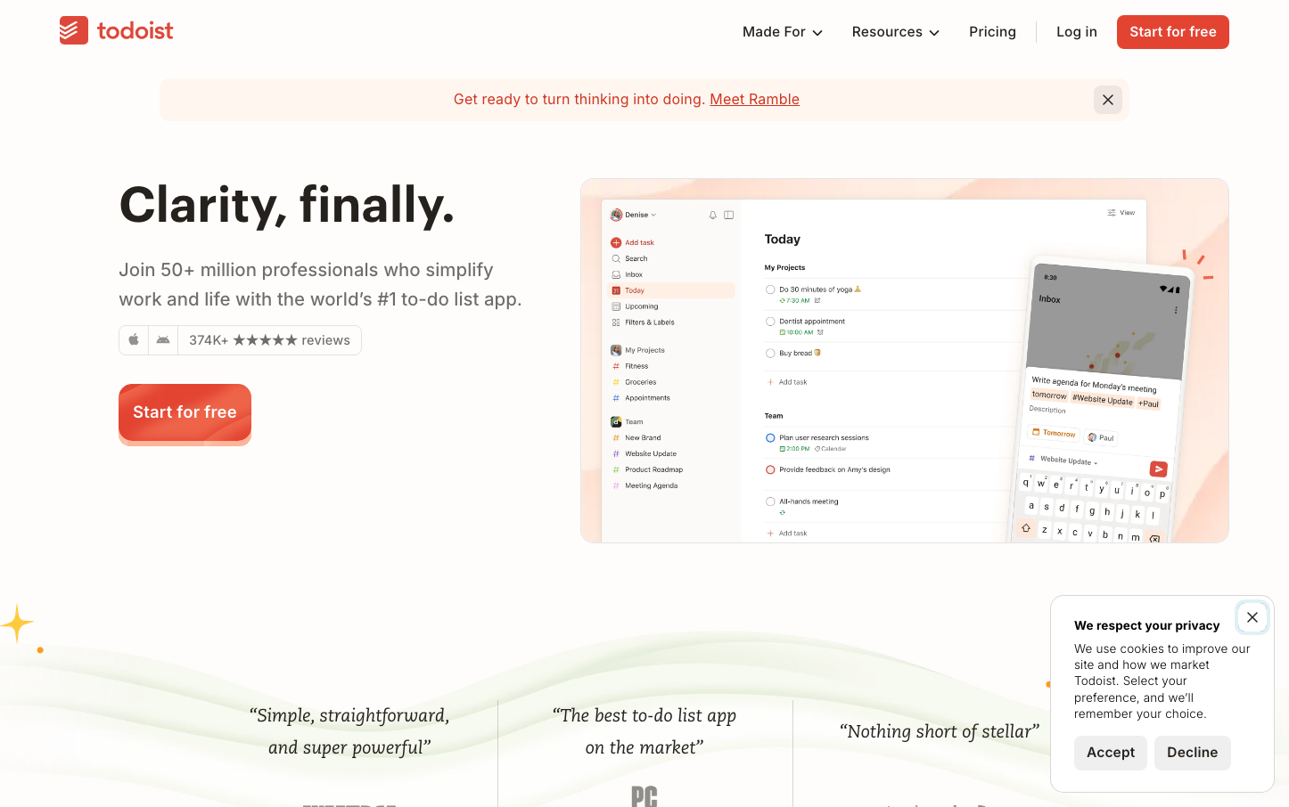
ProductivityTodoist embodies warm productivity through its signature coral-red that balances urgency with approachability. The dual-font system of geometric Graphik headlines and humanist Inter body text creates a professional yet welcoming atmosphere, while generous whitespace and subtle warm backgrounds suggest thoughtful organization rather than frantic task management.
Design Identity
Signature Color
Todoist Coral
#e44232
productive energy without stress - urgent yet approachable task management
Visual Identity
The extensive use of warm peachy backgrounds (#fff5eb, #fff9f3) combined with coral accent touches creates an unmistakably cozy productivity environment that stands apart from typical blue-heavy SaaS interfaces.
Component Style
Softly rounded corners (8px standard) with no harsh shadows, relying on subtle background tints and gentle borders. Components feel substantial but approachable, with coral accents providing just enough energy without overwhelming the interface.
Spacing Philosophy
Generous breathing room with substantial section gaps that prevent information overload. The interface prioritizes clarity over density, using ample whitespace to create a sense of calm organization rather than cramped efficiency.
Design Principles
- Border radius stays between 6-15px for friendly but professional feel
- Warm secondary colors (#fff5eb, #fff9f3) dominate backgrounds over stark white
- Typography mixing: Graphik for headers (600 weight), Inter for body (500 weight)
- Coral red (#e44232) used sparingly as primary accent only
- No harsh shadows - subtle elevation through background tints
Target Audience
Knowledge workers and creatives who want productivity tools that feel human rather than robotic - people who value thoughtful design over feature density
Mood
Design descriptions are AI-generated based on visual analysis and may not fully reflect the brand's official design guidelines.
Design System
Typography Scale
| Element | Font | Size | Weight | Line Height |
|---|---|---|---|---|
| body | 16px | 400 | 16px | |
| h1 | 55px | 600 | 63.25px | |
| h2 | 38px | 600 | 48.64px | |
| p | 15.5px | 500 | 20.925px | |
| a | 16px | 400 | 16px | |
| button | 15.5px | 500 | 20.925px | |
| input | 13.3333px | 400 | normal | |
| nav | 16px | 400 | 16px | |
| footer | 16px | 400 | 16px |
Color Palette
#000000#0077b5#1877f2#1da1f2#ff0000#e145a5#e44232#fae8d6#fff5eb#fff9f3#d1453b#ee5244