Help us build this. Leave comments, suggest improvements, and help create better design documentation for agents.
Toshiba
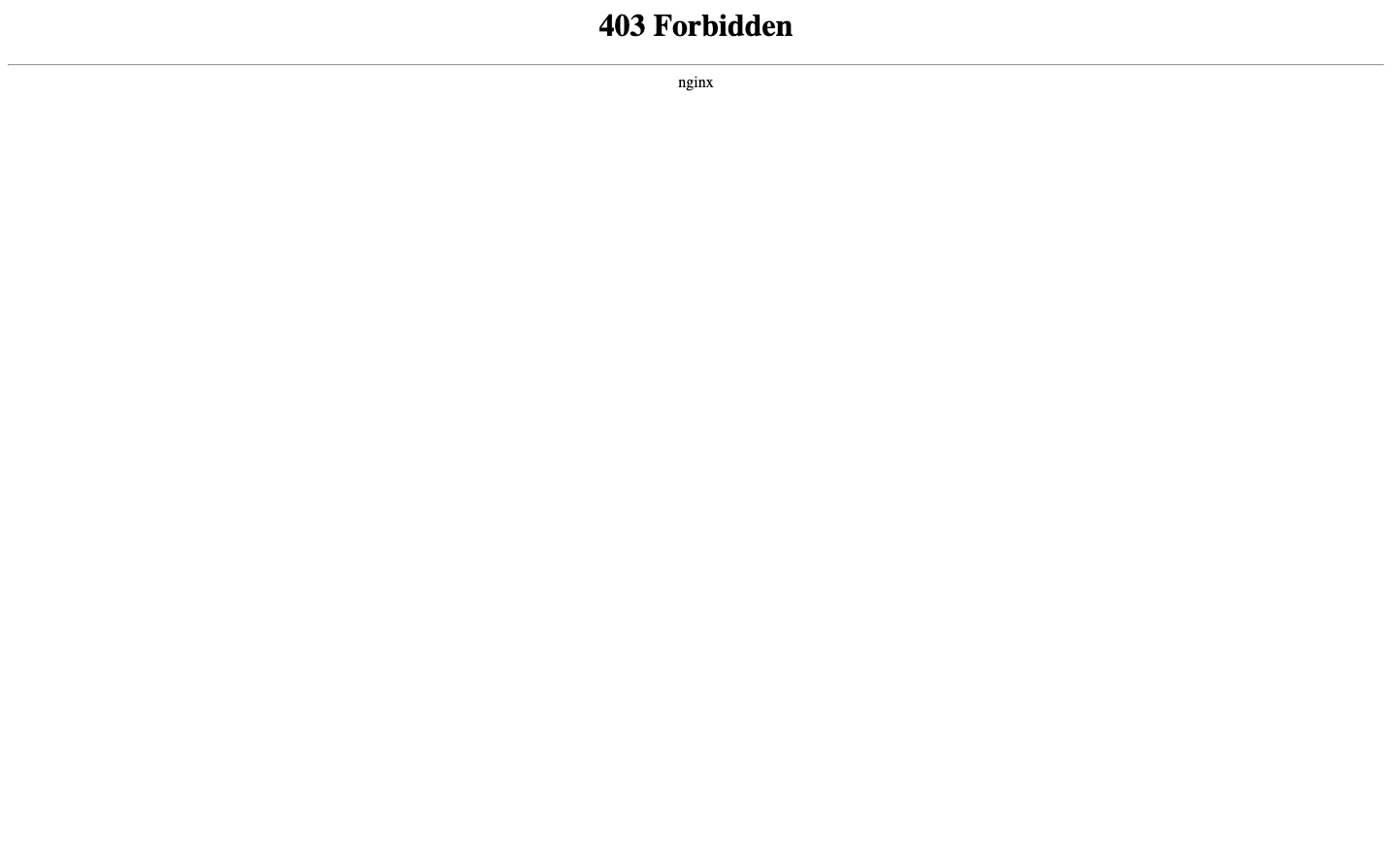
Consumer ElectronicsToshiba's brand aesthetic is defined by stark minimalism and institutional authority, using Times typography to convey heritage and reliability. The extreme whitespace and centered 403 error message creates a clinical, almost sterile atmosphere that prioritizes function over friendliness.
Design Identity
Signature Color
Corporate Black
#000000
Enterprise authority and no-nonsense functionality
Visual Identity
Extreme minimalism with vast amounts of whitespace, Times serif typography, and centered layouts that feel more like government documentation than modern web design
Component Style
Brutally minimal with zero visual decoration - no borders, shadows, or styling flourishes. Everything relies purely on typography hierarchy and whitespace for structure.
Spacing Philosophy
Maximalist whitespace approach with enormous gaps that create isolation and focus attention on sparse content elements. The spacing feels intentionally austere.
Design Principles
- Typography hierarchy relies solely on size and weight variations
- No decorative elements or visual embellishments
- Centered alignment for all primary content
- Monochromatic color approach
- Times serif for all text elements
Target Audience
Enterprise IT administrators and corporate users who prioritize reliability and institutional trust over modern user experience
Mood
Design descriptions are AI-generated based on visual analysis and may not fully reflect the brand's official design guidelines.
Design System
Typography Scale
| Element | Font | Size | Weight | Line Height |
|---|---|---|---|---|
| body | 16px | 400 | normal | |
| h1 | 32px | 700 | normal |
Color Palette
No colors extracted
UI Elements
No components detected