Help us build this. Leave comments, suggest improvements, and help create better design documentation for agents.
Trello
ProductivityTrello's brand radiates accessible productivity with a vibrant blue that feels both trustworthy and energetic. The Charlie typeface family creates a friendly yet professional tone, while the clean layout emphasizes clarity over complexity, making task management feel approachable rather than overwhelming.
Design Identity
Signature Color
Trello Blue
#0079BF
Reliable productivity enablement - trustworthy enough for enterprise work yet vibrant enough to inspire daily action
Visual Identity
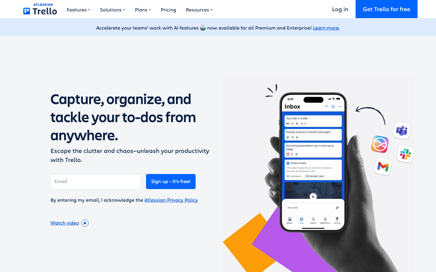
The distinctive balance of generous whitespace with a single powerful mobile device mockup showing actual product interface, creating immediate product understanding without visual clutter
Component Style
Softly rounded corners (8-12px radius) with vibrant solid fills, no heavy shadows or borders - components feel approachable and tactile, like physical cards you'd want to interact with
Spacing Philosophy
Asymmetric layout with concentrated left-side content and expansive right-side product showcase, using generous 40-60px gaps to let the headline and mobile demo breathe independently
Design Principles
- Headlines use Charlie Display at 48px for impact without aggression
- Body text stays at 16-20px for comfortable scanning
- Border radius consistently 8-12px across all interactive elements
- Primary actions use full-saturation blue with white text
- Mobile-first product demonstration over abstract graphics
Target Audience
Team coordinators and project managers who need powerful organization tools but want them to feel intuitive rather than enterprise-complex
Mood
Design descriptions are AI-generated based on visual analysis and may not fully reflect the brand's official design guidelines.
Design System
Typography Scale
| Element | Font | Size | Weight | Line Height |
|---|---|---|---|---|
| body | 20px | 400 | 30px | |
| h1 | 48px | 500 | 60px | |
| h2 | 16px | 500 | 21.3333px | |
| h3 | 16px | 500 | 21.3333px | |
| h4 | 20px | 500 | 24px | |
| p | 16px | 400 | 24px | |
| a | 16px | 400 | 24px | |
| button | 16px | 400 | 24px | |
| input | 16px | 400 | 24px | |
| nav | 16px | 400 | 24px |
Color Palette
No colors extracted