Help us build this. Leave comments, suggest improvements, and help create better design documentation for agents.
UBS
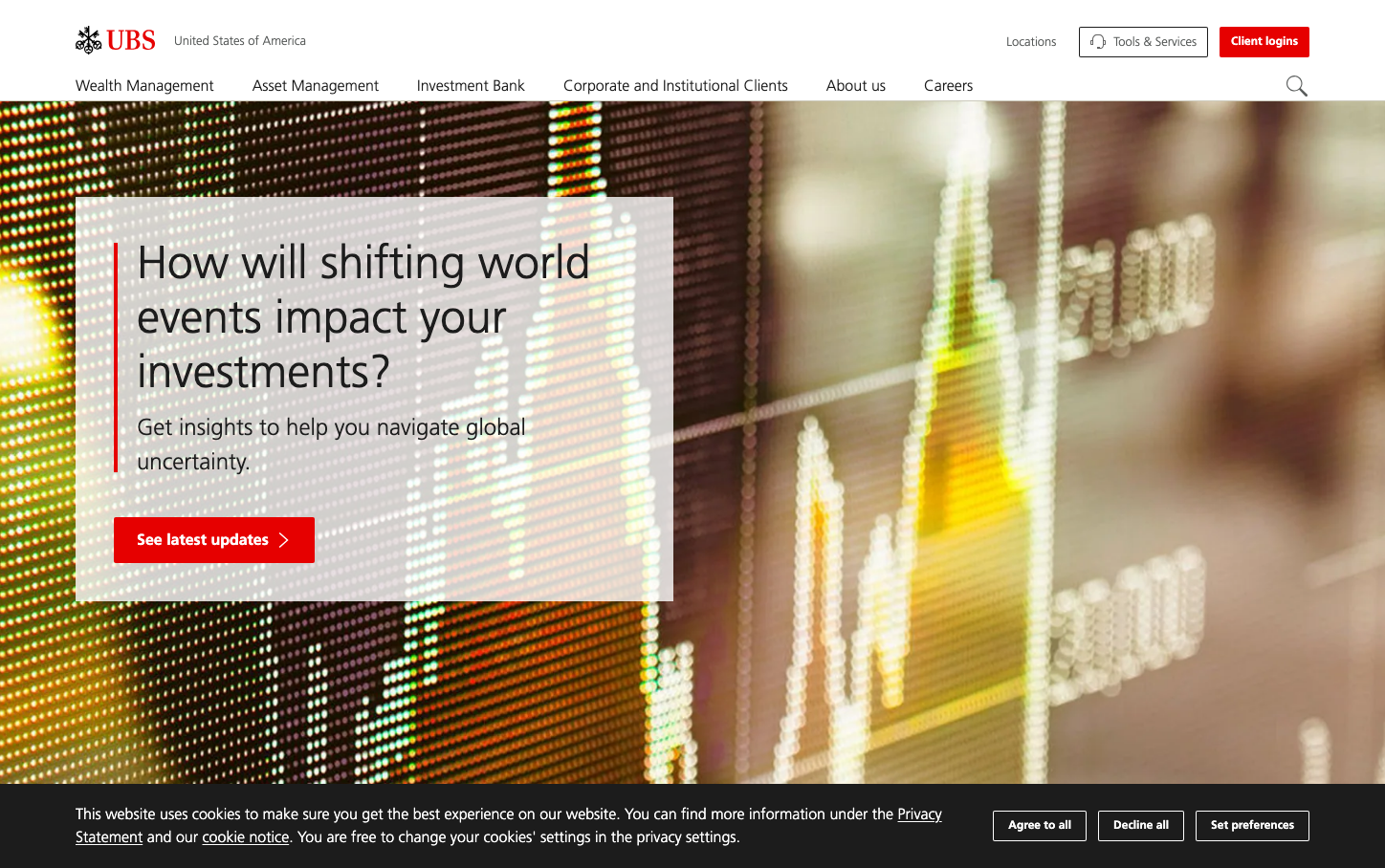
FinanceUBS projects Swiss precision through high-contrast financial data visualization and strategic use of pure red as an accent. The brand balances institutional gravitas with dynamic market energy through abstract digital displays and clean typography hierarchy.
Design Identity
Signature Color
UBS Cardinal Red
#E60000
Swiss banking authority with decisive action - cutting through market noise with institutional confidence
Visual Identity
Abstract financial data streams displayed as colorful LED-style dot matrices create an unmistakable backdrop that suggests real-time market intelligence and technological sophistication.
Component Style
Clean rectangular buttons with sharp corners and no visible shadows. The primary CTA uses bold red with crisp white typography, while the interface maintains minimal borders and relies on color contrast rather than elevation for hierarchy.
Spacing Philosophy
Generous whitespace in content cards creates breathing room for complex financial information, while the navigation maintains compact spacing to maximize screen real estate for data visualization.
Design Principles
- Red accent color used sparingly for primary actions only
- Frutiger typography at 300 weight for headlines creates approachable authority
- Sharp rectangular corners throughout - no border radius exceeding 4px
- Data visualization uses warm spectrum (yellow/orange/red) against neutral backgrounds
- Content cards use semi-transparent white overlays for readability
Target Audience
Affluent investors and institutional clients who value Swiss banking heritage combined with cutting-edge financial technology and market insights
Mood
Design descriptions are AI-generated based on visual analysis and may not fully reflect the brand's official design guidelines.
Design System
Typography Scale
| Element | Font | Size | Weight | Line Height |
|---|---|---|---|---|
| body | 16.0016px | 400 | 16.0016px | |
| h1 | 16.0016px | 400 | 16.0016px | |
| h2 | 16.0016px | 400 | 16.0016px | |
| h3 | 24.0024px | 300 | 36.0036px | |
| h4 | 14.0014px | 500 | 20.002px | |
| p | 16.0016px | 400 | 16.0016px | |
| a | 22.0022px | 300 | 26.0026px | |
| button | 16.0016px | 400 | normal | |
| nav | 16.0016px | 400 | 16.0016px | |
| header | 16.0016px | 400 | 16.0016px |
Color Palette
No colors extracted