Help us build this. Leave comments, suggest improvements, and help create better design documentation for agents.
Viva Wallet
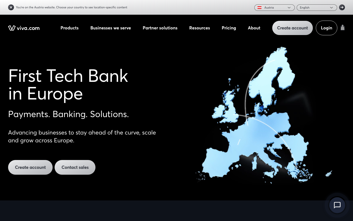
FintechViva Wallet embodies fintech minimalism with stark black backdrops that command authority and subtle cyan accents that suggest digital precision. The AvertaPE typography creates approachable professionalism while the dramatic contrast between darkness and illuminated Europe map evokes technological sophistication conquering traditional banking.
Design Identity
Signature Color
Fintech Cyan
#2196F3
Digital trust and European technological advancement
Visual Identity
The dramatic interplay between deep black space and illuminated cyan geographical elements - specifically the glowing Europe map that serves as both data visualization and brand territory marker.
Component Style
Subtle rounded corners with 6px radius create approachable tech feel. Buttons appear lightweight with minimal borders, emphasizing content over chrome. The design favors negative space over heavy visual treatment, with components floating against dark backgrounds.
Spacing Philosophy
Generous breathing room around hero content with tight, efficient spacing in navigation. The layout uses asymmetrical composition - content anchored left while the illuminated map claims the right half, creating dynamic visual tension.
Design Principles
- Border radius consistently 6px across interactive elements
- Typography hierarchy uses only 12px, 16px, and 18px with 600 weight for emphasis
- Dark backgrounds (#000000) dominate with strategic cyan (#2196F3) highlights
- Geographical data visualization as core brand element
- Asymmetrical left-content, right-visual layout pattern
Target Audience
European fintech decision-makers and CFOs who value sophisticated banking infrastructure over flashy consumer features
Mood
Design descriptions are AI-generated based on visual analysis and may not fully reflect the brand's official design guidelines.
Design System
Typography Scale
| Element | Font | Size | Weight | Line Height |
|---|---|---|---|---|
| body | 16px | 400 | 24px | |
| h1 | 16px | 400 | 24px | |
| h2 | 16px | 400 | 24px | |
| p | 16px | 400 | 24px | |
| a | 18px | 600 | 28px | |
| button | 12px | 400 | 18px | |
| input | 12px | 400 | 18px | |
| nav | 16px | 400 | 24px | |
| footer | 16px | 400 | 24px | |
| main | 16px | 400 | 24px |
Color Palette
#cccccc#000000#f0f0f0#ececec#3b82f6#2196f3#ffffff#cecece#9b99f0#909090