Help us build this. Leave comments, suggest improvements, and help create better design documentation for agents.
Vocier
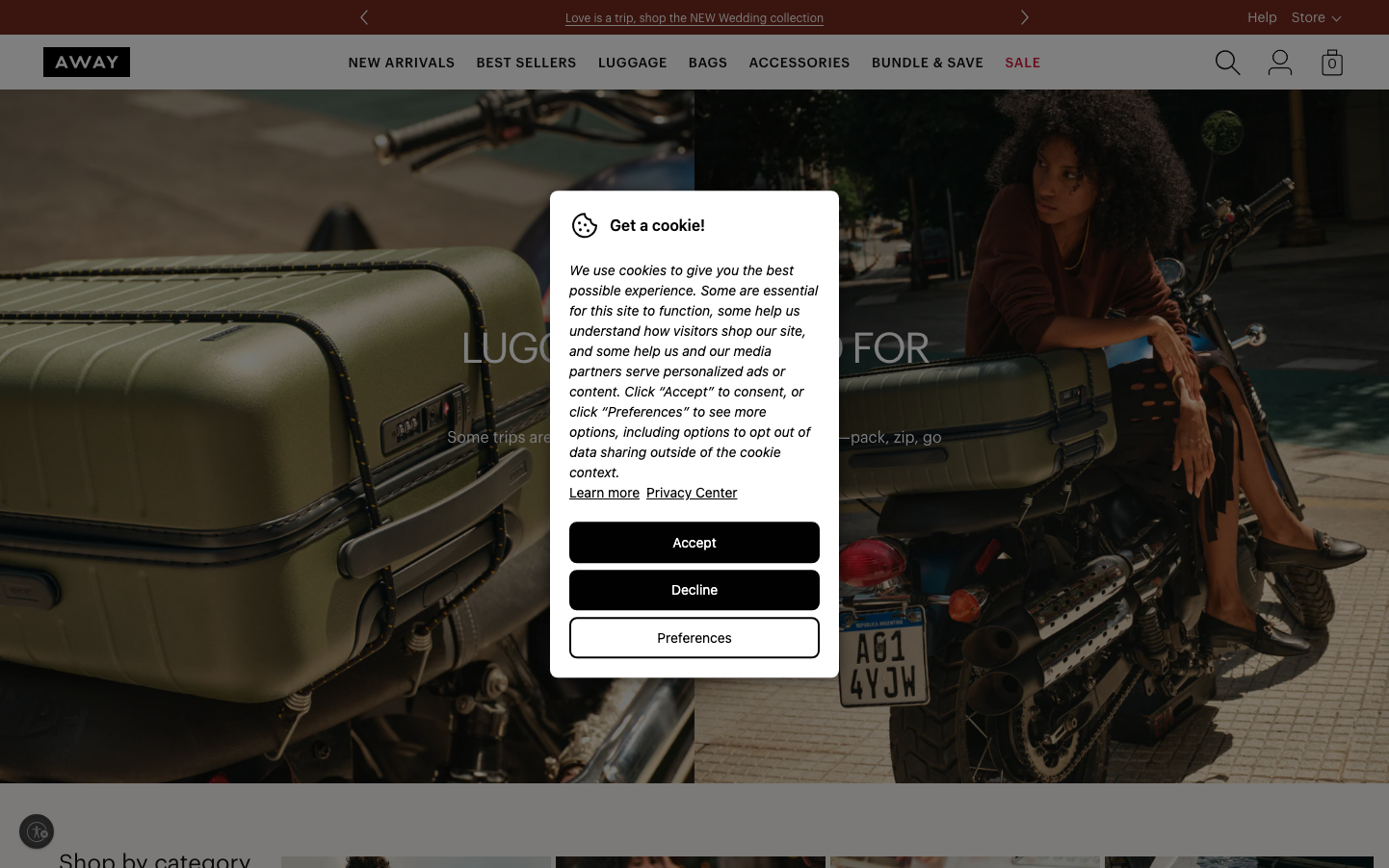
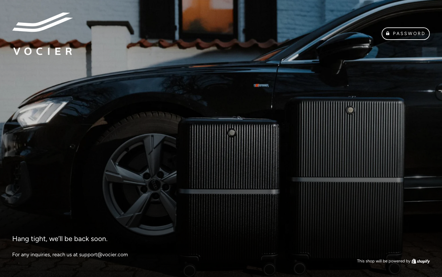
RetailVocier embodies sophisticated minimalism with a darkened, cinematic aesthetic that speaks to luxury travel experiences. The monochromatic palette creates an atmosphere of premium restraint, while the geometric Figtree typography maintains approachable elegance without sacrificing refinement.
Design Identity
Signature Color
Vocier Charcoal
#1A1A1A
sophisticated luxury and premium travel confidence
Visual Identity
Dramatic low-contrast photography paired with stark white typography on deep charcoal backgrounds, creating a gallery-like presentation that feels more like a luxury magazine than a typical e-commerce site.
Component Style
Subtle, barely-there borders with minimal contrast. The PASSWORD button shows refined pill-shaped edges with understated styling - everything feels whisper-quiet and premium rather than demanding attention through bold styling.
Spacing Philosophy
Generous negative space dominates the layout with the hero image taking up most of the viewport, while UI elements are positioned with museum-like precision in corners and edges, creating breathing room that suggests luxury.
Design Principles
- Typography uses only normal 400 weight across all elements for consistent lightness
- Font sizes stick to three core sizes: 15px for interactions, 17px for body, 23px for headings
- Line heights maintain 1.6x ratio for comfortable reading
- Monochromatic color scheme with high contrast white text on dark backgrounds
- Pill-shaped buttons with rounded corners for softened interactions
Target Audience
Affluent travelers and design-conscious professionals who value understated luxury over flashy branding
Mood
Design descriptions are AI-generated based on visual analysis and may not fully reflect the brand's official design guidelines.
Design System
Typography Scale
| Element | Font | Size | Weight | Line Height |
|---|---|---|---|---|
| body | 17px | 400 | 27.2px | |
| h1 | 23px | 400 | 36.8px | |
| h2 | 23px | 400 | 36.8px | |
| p | 17px | 400 | 27.2px | |
| a | 15px | 400 | 21.3px | |
| button | 15px | 400 | 21.3px | |
| input | 17px | 400 | 27.2px | |
| header | 17px | 400 | 27.2px | |
| body | 17px | 400 | 27.2px | |
| h1 | 23px | 400 | 36.8px |
Color Palette
No colors extracted