Help us build this. Leave comments, suggest improvements, and help create better design documentation for agents.
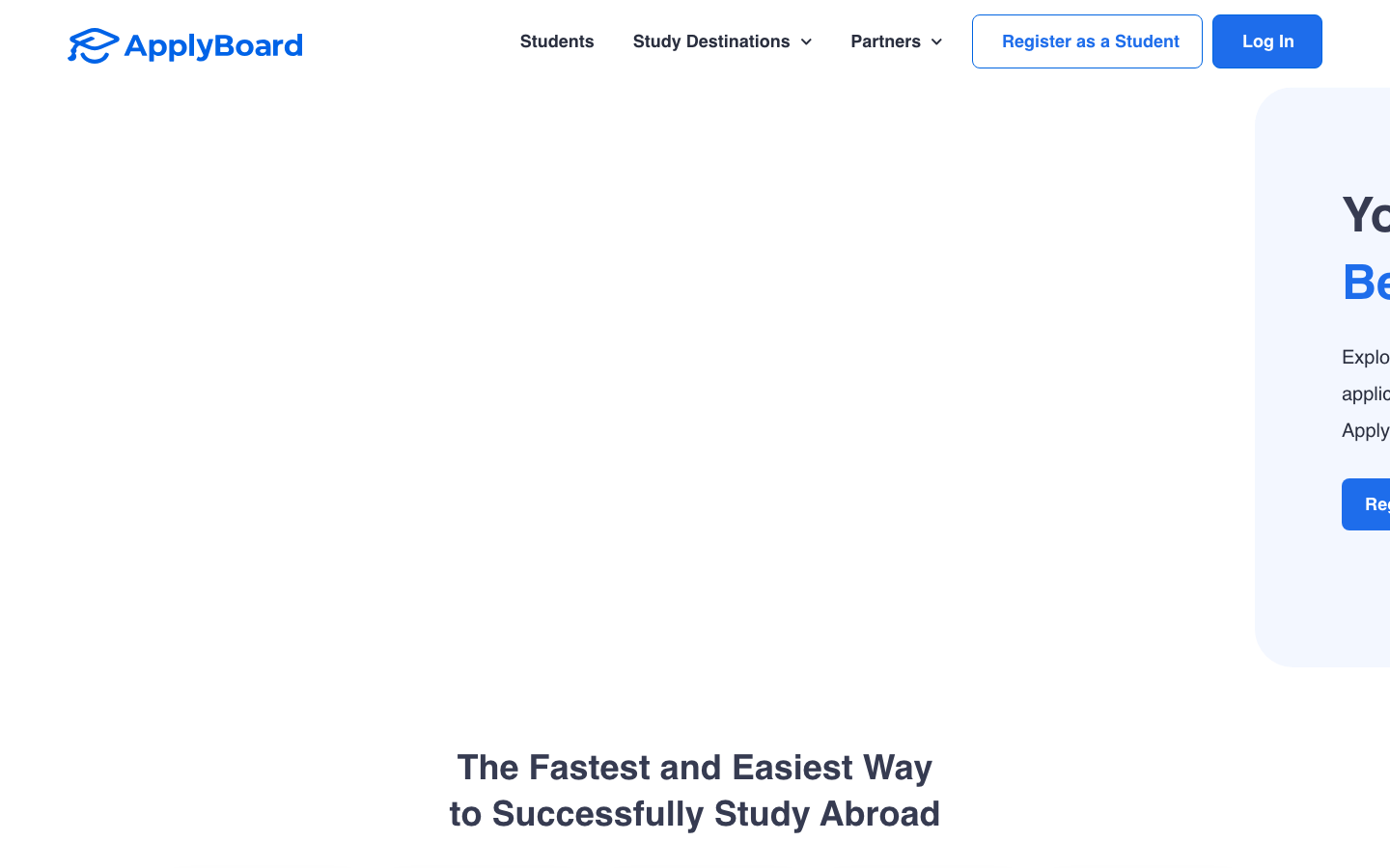
ApplyBoard
EdTechApplyBoard employs a trustworthy academic aesthetic with crisp blue as the authority color and Montserrat/Open Sans typography that balances institutional credibility with approachable guidance. The design radiates educational professionalism through generous whitespace and clean component hierarchy, targeting students who need reliable guidance for life-changing study abroad decisions.
Design Identity
Signature Color
Academic Trust Blue
#007aff
educational authority and reliable guidance for international study decisions
Visual Identity
Expansive whitespace with centered content blocks and institutional blue accents create an unmistakable academic counseling aesthetic that feels both authoritative and supportive.
Component Style
Rounded corners with moderate 8px radius on buttons, clean borders without heavy shadows - components feel approachable yet professional, like university administration materials digitized thoughtfully.
Spacing Philosophy
Abundant whitespace creates breathing room that reduces anxiety around major life decisions, with generous 48px+ gaps between sections that mirror university brochure layouts.
Design Principles
- Typography hierarchy uses Montserrat at 36px/700 for headlines to establish authority
- Body text in Open Sans 16px/400 maintains readability across all education levels
- Blue accents (#007aff) reserved for primary actions and trust signals only
- Border radius consistently 8px for approachable but not playful feeling
- Button weights at 600 provide confidence without aggression
Target Audience
International students and their families making high-stakes education decisions who need trustworthy guidance through complex application processes
Mood
Design descriptions are AI-generated based on visual analysis and may not fully reflect the brand's official design guidelines.
Design System
Typography Scale
| Element | Font | Size | Weight | Line Height |
|---|---|---|---|---|
| body | 14px | 300 | 21px | |
| h2 | 36px | 700 | 48px | |
| h3 | 14px | 400 | 24px | |
| p | 16px | 400 | 28px | |
| a | 14px | 300 | 21px | |
| button | 16px | 600 | 24px | |
| nav | 14px | 300 | 21px | |
| header | 14px | 300 | 21px | |
| footer | 14px | 300 | 21px |
Color Palette
#000000#abb8c3#ffffff#f78da7#cf2e2e#ff6900#fcb900#7bdcb5#00d084#8ed1fc#0693e3#9b51e0