Help us build this. Leave comments, suggest improvements, and help create better design documentation for agents.
Careem
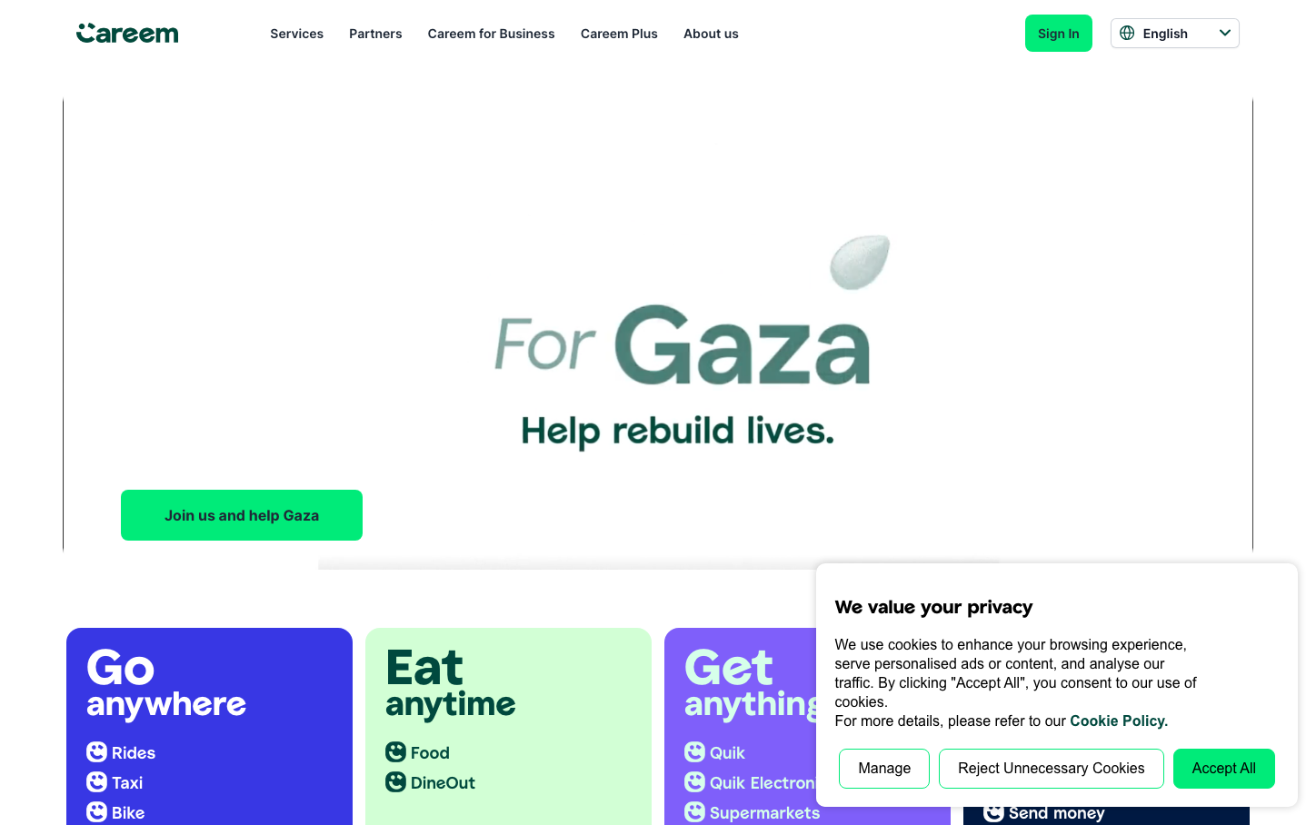
MobilityCareem's brand exudes warmth and accessibility through its vibrant emerald green signature color and custom CareemSans typography that balances friendliness with authority. The design creates an approachable yet professional atmosphere that speaks to everyday mobility needs across diverse communities.
Design Identity
Signature Color
Careem Emerald
#00D4AA
Trust and growth in emerging markets - vibrant enough to stand out in crowded urban environments while conveying reliability for essential services
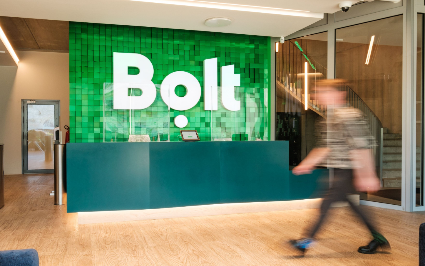
Visual Identity
The distinctive emerald green paired with generous rounded corners and the hero Gaza campaign messaging creates an instantly recognizable humanitarian-tech hybrid aesthetic that sets Careem apart from typical ride-sharing competitors.
Component Style
Buttons feature substantial rounded corners (approximately 8-12px radius) with bold, saturated backgrounds and clean white text. Components feel substantial and finger-friendly, optimized for mobile-first interactions with generous touch targets and no harsh shadows.
Spacing Philosophy
Breathing room dominates with large hero sections and substantial padding around key CTAs. The layout uses expansive whitespace to create calm in what could be chaotic urban service scenarios, with approximately 32-48px gaps between major sections.
Design Principles
- Emerald green (#00D4AA) anchors all primary actions and brand moments
- CareemSans custom typography for headlines, Inter for body text maintains hierarchy
- Button radius consistently 8-12px for approachable, mobile-optimized feel
- No harsh drop shadows - flat design with subtle depth through color contrast
- Generous 16px+ button padding ensures accessibility across device types
Target Audience
Urban professionals and families in Middle East and South Asia who need reliable daily transportation and delivery services, particularly those who value community-conscious brands with local market understanding.
Mood
Design descriptions are AI-generated based on visual analysis and may not fully reflect the brand's official design guidelines.
Design System
Typography Scale
| Element | Font | Size | Weight | Line Height |
|---|---|---|---|---|
| body | 16px | 400 | 16px | |
| h1 | 0px | 700 | 97px | |
| h2 | 54px | 700 | 54px | |
| h3 | 36px | 700 | 44px | |
| h4 | 14px | 600 | 21px | |
| p | 28px | 400 | 36px | |
| a | 16px | 400 | 16px | |
| button | 16px | 400 | 18.4px | |
| nav | 16px | 400 | 16px | |
| header | 16px | 400 | 16px |
Color Palette
#000000#3b82f6#ffffff#808080