Help us build this. Leave comments, suggest improvements, and help create better design documentation for agents.
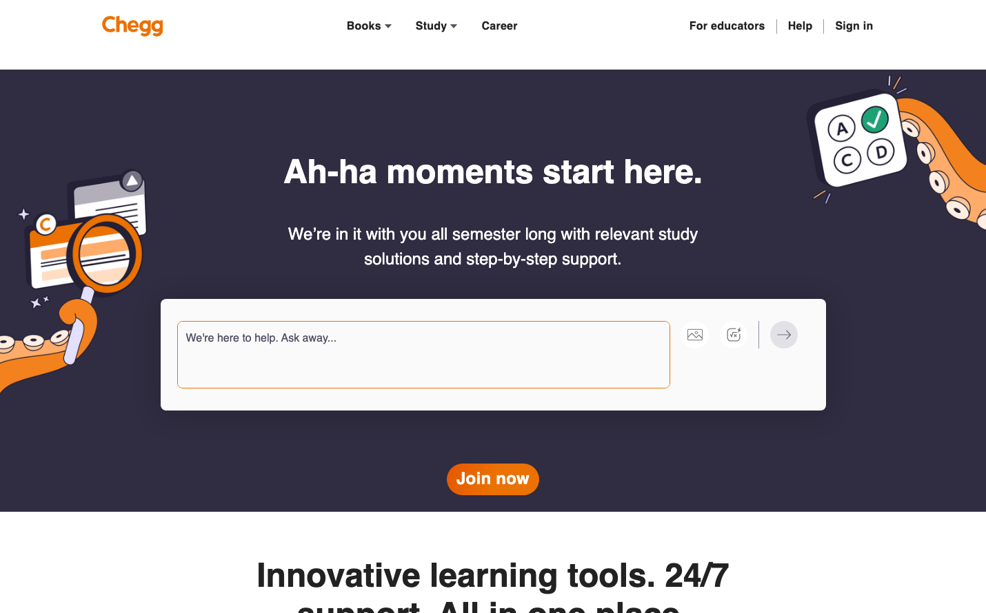
Chegg
EdTechChegg's brand radiates academic optimism through warm orange energy against deep purple midnight tones, creating a cozy study-session atmosphere. The playful illustrated elements and friendly geometric shapes suggest approachable expertise rather than intimidating academia.
Design Identity
Signature Color
Chegg Orange
#FF6B35
energetic academic support - the warmth of finding the right answer
Visual Identity
Whimsical educational illustrations with floating academic icons (magnifying glass, answer sheets, lightbulbs) rendered in a consistent orange-and-white style against dark backgrounds
Component Style
Soft, approachable rounded corners with generous padding. The input field has subtle borders and ample breathing room, while the CTA button features bold rounded edges that feel friendly rather than corporate. No harsh shadows - everything has a gentle, supportive presence.
Spacing Philosophy
Generous vertical breathing room creates an unhurried study environment. Large 64px+ gaps between sections prevent cognitive overwhelm, while the centered layout with wide margins feels focused and contained like a dedicated study space.
Design Principles
- Typography uses extreme weight contrast: 900 weight for headlines, 400-500 for body
- Border radius consistently around 8-12px for friendly approachability
- Orange accent color appears only in CTAs and illustrations for maximum impact
- Dark purple background creates focus like late-night study sessions
- Illustrations always include academic metaphors rendered in orange and white
Target Audience
College students and academic strugglers who need encouraging, judgment-free educational support during stressful study periods
Mood
Design descriptions are AI-generated based on visual analysis and may not fully reflect the brand's official design guidelines.
Design System
Typography Scale
| Element | Font | Size | Weight | Line Height |
|---|---|---|---|---|
| body | 16px | 400 | 20px | |
| h1 | 48px | 900 | 57.6px | |
| h2 | 48px | 900 | 57.6px | |
| h3 | 32px | 700 | 48px | |
| h5 | 22px | 700 | 26.4px | |
| p | 24px | 400 | 36px | |
| a | 16px | 500 | 20.8px | |
| button | 14px | 500 | 18.2px | |
| input | 13.3333px | 400 | normal | |
| nav | 16px | 400 | 20px |
Color Palette
No colors extracted