Help us build this. Leave comments, suggest improvements, and help create better design documentation for agents.
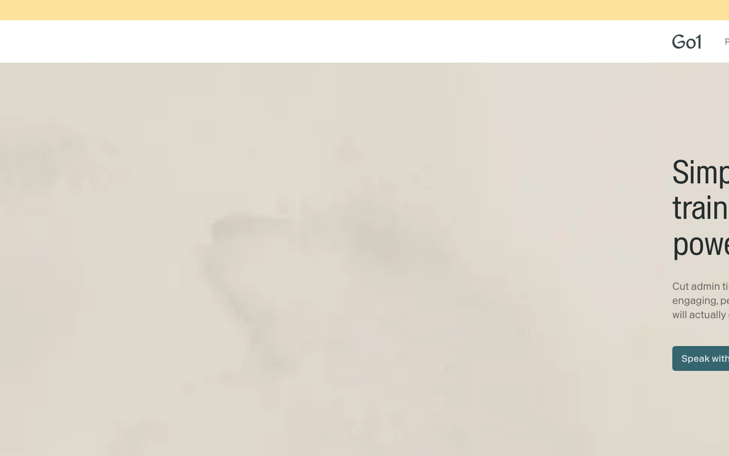
Go1
EdTechGo1 embraces a warm, earthy aesthetic that feels both approachable and premium, using natural tones like marigold and copper against ivory backgrounds. The custom 'Enduro' typography system creates a distinctive voice that balances professionalism with human warmth, while the generous whitespace and muted color palette evoke trust and sophistication in the learning space.
Design Identity
Signature Color
Go1 Teal
#35656e
Professional depth and learning-focused authority - a color that suggests knowledge, growth, and reliable expertise
Visual Identity
The distinctive warm earth-tone palette combined with the custom Enduro typography family creates immediate recognition - the brand avoids typical tech blues/purples in favor of natural, human-centered colors that feel more like a premium educational institution than a software platform.
Component Style
Components feel substantial yet approachable with soft, organic treatments. Buttons and interactive elements likely use subtle rounded corners (4-6px) with the signature teal (#35656e) creating depth without harsh shadows - everything feels tactile and inviting rather than sterile.
Spacing Philosophy
Generous, breathing room philosophy with ample whitespace that creates a sense of calm focus. The layout feels unrushed with likely 48-64px section spacing that mirrors the thoughtful pace of learning, while maintaining intimate 16-24px component padding.
Design Principles
- Typography uses dual font system: EnduroNarrow for headlines (64px/48px), regular Enduro for body (16-20px)
- Colors stay within the warm earth spectrum - no harsh blues or stark whites
- Border radius never exceeds 6px to maintain approachable softness
- Line heights are generous (1.4-1.5x) for reading comfort
- All accent colors derive from natural palette: marigold, copper, teal
Target Audience
Learning and development professionals, corporate trainers, and HR leaders who value substance over flashiness and need platforms that feel trustworthy for enterprise learning initiatives.
Mood
Design descriptions are AI-generated based on visual analysis and may not fully reflect the brand's official design guidelines.
Design System
Typography Scale
| Element | Font | Size | Weight | Line Height |
|---|---|---|---|---|
| body | 16px | 400 | 24px | |
| h1 | 64px | 400 | 70.4px | |
| h2 | 48px | 400 | 52.8px | |
| h3 | 20px | 500 | 24px | |
| p | 20px | 400 | 28px | |
| a | 14px | 400 | 20px | |
| button | 16px | 400 | 24px | |
| nav | 16px | 400 | 24px | |
| footer | 16px | 400 | 24px | |
| main | 16px | 400 | 24px |
Color Palette
#daab4e#e6804c#faf9f4#9a9389#35656e#73746e#fee19a#f1eee7#ffffff#c7d1d1#87847c#ded8ce