Help us build this. Leave comments, suggest improvements, and help create better design documentation for agents.
Via
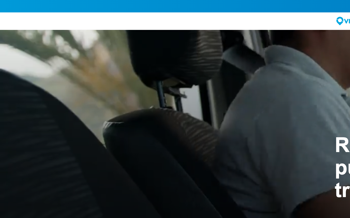
MobilityVia embraces a monochromatic, documentary-style aesthetic that feels grounded in real-world precision rather than digital polish. The heavy use of Inter and Onest creates a technical yet human voice, while the muted grayscale palette suggests professional reliability without corporate sterility.
Design Identity
Signature Color
Via Charcoal
#10151d
authoritative precision - suggests depth of expertise and no-nonsense functionality
Visual Identity
Photographic realism meets minimal typography - the brand feels more like a documentary than a tech product, with real hands-on-work imagery balanced by clean geometric type treatments
Component Style
Understated and functional - components appear to have minimal styling with subtle shadows (2px drop shadows with 10% opacity), clean edges, and an emphasis on content over decoration. Everything feels purposefully unadorned.
Spacing Philosophy
Measured restraint with 32px column gaps creating breathing room while maintaining density. The layout suggests precision without excess - every pixel serves a purpose.
Design Principles
- Shadows never exceed 2px blur with 10% black opacity
- Typography uses only Onest for headers (600 weight) and Inter for body (400-500 weight)
- Color palette restricted to grayscale spectrum from #10151d to #e1e2e3
- Line heights maintain 1.625 ratio for body text (26px/16px)
- 32px column gaps for consistent horizontal rhythm
Target Audience
Operations professionals and logistics managers who value substance over style - people who need tools that work reliably in high-stakes environments
Mood
Design descriptions are AI-generated based on visual analysis and may not fully reflect the brand's official design guidelines.
Design System
Typography Scale
| Element | Font | Size | Weight | Line Height |
|---|---|---|---|---|
| body | 16px | 400 | 26px | |
| h1 | 84px | 600 | 92.4px | |
| h2 | 44px | 600 | 52.8px | |
| h3 | 30px | 600 | 36px | |
| p | 18px | 600 | 29.25px | |
| a | 16px | 500 | 26px | |
| button | 13.3333px | 400 | normal | |
| input | 18px | 400 | 29.268px | |
| nav | 16px | 400 | 26px | |
| header | 16px | 400 | 26px |
Color Palette
#10151d#8c9196#6e757b#e1e2e3